


: the second time’s a charm for Acer’s flagship Ultrabook")

OVERVIEW
We want you to get the most out of this theme. We’ve rounded up every resource you could ever possibly need right here so you don’t have to go searching through buried links and documents. Enjoy!
DOCUMENTATION
Getting Started
Requirements
- PHP 5.0+
- WordPress 3.9+
- cURL must be enabled on your web server (http://stackoverflow.com/questions/1347146/how-to-enable-curl-in-php-xampp)
- If you are using the social counts widget, file_get_contents() requires that you have allow_url_fopen turned on (http://www.php.net/manual/en/filesystem.configuration.php#ini.allow-url-fopen)
- If you have PHP version 5.3.9+ and you have more than 1,000 options posted in your theme options (this will rarely ever happen) you need to increase your max_input_vars setting on your web server (http://stackoverflow.com/questions/10303714/php-max-input-vars)
Installation
ThemeForest provides two different theme files to download. You need only download the installable theme file unless you want additional reference material such as layered PSD designs or PNG components. Once you’ve downloaded the installable theme zip file, there are two ways to install it in your WordPress install:
- WordPress Theme Installer
- Manual FTP Upload
We usually recommend the FTP method since it cuts out the middleman (WordPress uploader code) and is the most straightforward way to do it. However some prefer directly installing in WordPress for convenience. To use the WordPress installer:
- Login to WordPress and go to Appearance >> Themes
- Click the Install Themes tab at the top
- Click the Upload link
- Choose the theme .zip file on your computer that you downloaded from ThemeForest and click Install Now
- The theme should now be available to activate in your list of themes
If you run into any issues it is possible that a plugin or internal component is causing issues, and sometimes max upload filesize limits imposed by web hosts can also wreak havoc on larger themes. Whatever the cause, if you want to manually upload the theme via FTP:
- Unzip the theme file that you downloaded from ThemeForest
- Connect to your web server via FTP (contact your web host if you don’t know how to do this)
- Navigate to your WordPress install and find the wp-content/ folder, and then the themes/ folder inside of that
- Upload the techwise folder directly inside of the themes/ folder so that it exists in this location: /wp-content/themes/techwise
- Login to WordPress and go to Appearance >> Themes
- The theme should now be available to activate in your list of themes
Important The folder you install/upload should be called “techwise” and contain the style.css file directly inside of it (this is the file that tells WordPress the name of the theme). Do not install/upload any other folder, such as “Techwise-Theme” for instance. This could potentially cause problems or at the very least confusion later on.
Importing the Demo Content
We have made recreating the demo site easy with a 3-step process. This process assumes you have a blank WordPress install with no content.
1. Import the content
- Go to Tools >> Import >> WordPress >> Choose File and select the techwise.xml file that is provided with your ThemeForest download.
- Click “Upload file and import”
- Select “Download and import file attachments” and click Submit (don’t make any author assignments, unless of course you want to reassign posts to existing authors).
2. Activate the theme
3. Install the settings (click the green button at the bottom of the Theme Options page)
Notes:
- It is recommended to delete the default “Sample Post” blog post that WordPress automatically creates for new installs (you can likewise delete the “Sample Page”)
- Your sample users will not have bios or profile fields filled out because WordPress doesn’t include that info when it imports the authors, so you’ll have to add that data. You’ll likely be deleting them and replacing them with your own users anyway (or assigning all posts to yourself as admin) so it doesn’t matter much.
- The images used in the live preview were purchased for demonstration purposes and are licensed correctly. The demo XML contains placeholder images that you can replace with your own images. Demo images licensing info is located here (click the images tab at the bottom)
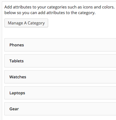
- Because the WordPress category ID’s might not match up correctly in some cases, you may need to go to Theme Options >> Categories and change the selections for the existing categories there. Here is a screenshot of what the categories are in the demo:
4. Assign menus (only do this if you don’t see the menu items in your menus)
- Go to Appearance >> Menus >> Manage Locations
- Select “Section Menu” for the section menu, “Top Menu” for the top menu, and “Main Menu” for the main and utility menus
AJAX Thumbnail Rebuild
If you are installing this theme on a brand new blank WordPress installation, you can skip this section. If you already have articles with featured images in your WordPress site before you install the theme, you will need to resize your featured images to fit the dimensions of all the thumbnail areas. To easily and quickly do this, install the AJAX Thumbnail Rebuild plugin, and then go to Tools >> Rebuild Thumbnails and run it once. After the first time you run it, you will not have to run it again since any images uploaded after you have installed the theme will automatically be sized correctly. It only applies to images uploaded to your media library before you install the theme.
Tip If you have a lot of images it might take a while to complete – just let it work its magic and if for some reason it doesn’t finish the first time feel free to run it again as many times as you want – it won’t hurt anything or create any duplicate images.
Code Structure
HTML
This theme is built using Bootstrap and is a fluid, responsive layout with a max content width of 1340px. All of the code is spaced, indented, commented in-line, and semantically written to make it as easy as possible to edit and customize to your particular needs. The theme is built with valid HTML5 code and has been tested to be compatible with Chrome, Firefox, Opera, Safari, IE9+, and was also tested on an iPad using Chrome and Safari as well as an iPhone. The theme is HiDPI/retina compatible. It was built and tested with WordPress version 4.0. The general layout of the HTML code is as follows:
<div class="container-fluid no-padding">

  <div id="header-bar">

    <div class="row">

      <div class="col-md-12">

        <div id="header-inner" class="container-inner">

          ...header bar...

        </div>

      </div>

    </div>

  </div>

</div>

<div class="container-fluid no-padding">

  <div id="sticky-bar">

    <div class="row">

      <div class="col-md-12">

        <div id="sticky-inner" class="container-inner">

          ...sticky bar...

        </div>

      </div>

    </div>

  </div>

</div>

<div class="after-header">

  <div class="container-fluid no-padding builder-section builder-loop">

    <div class="row">

      <div class="col-md-12">

        <div class="container-inner">

          <div class="row loop-row">

            ...post loop...

          </div>

        </div>

      </div>

    </div>

  </div>

  ...additional page builders (same structure as post loop)...

  <div id="footer" class="container-fluid no-padding builder-section builder-widgets">

    <div class="row">

      <div class="col-md-12">

        <div class="container-inner">

          <div class="widgets-inner shadowed">

            <div class="row">

              ...footer widgets...

            </div>

          </div>

          <div class="subfooter shadowed">

            <div class="row">

              ...subfooter...

            </div>

          </div>

        </div>

      </div>

    </div>

  </div>

</div>
CSS
The style scaffolding for this theme is provided by Bootstrap which enables all the responsive layouts and basic styling of most elements. The code for the bootstrap begins at the top of the style.css file, followed by the rest of the theme code. The responsive styles are at the end of the file.
Since this theme is both responsive and HiDPI/retina ready, it has a fairly complex stylesheet and makes use of media queries to serve specific styles for specific displays. Also, any Bootstrap style overrides that are necessary for the theme are also within the style.css file. We have provided a blueprint of the stylesheet so that you can more easily find what you’re looking for:
/*************************************************
begin bootstrap framework
*************************************************/

Bootstrap framework (minified)

/*************************************************
general fonts
*************************************************/

font declarations

/*************************************************
general utilities
*************************************************/

some css resets and utility classes

/*************************************************
ads
*************************************************/

general ad styles

/*************************************************
icons and buttons
*************************************************/

general interactive elements used throughout

/*************************************************
trending and sharing
*************************************************/

the popover trending/sharing buttons

/*************************************************
overlays
*************************************************/

used whenever there is a colored gradient overlay for any post

/*************************************************
header bar
*************************************************/

styles for the top most header bar

/*************************************************
sticky bar
*************************************************/

styles for the fixed menu bar under the header

/*************************************************
post sharing
*************************************************/

the styles for the addthis post sharing

/*************************************************
bar headers
*************************************************/

used at the top of all widgets and page builders

/*************************************************
sortbar
*************************************************/

the drop down toggle sort button containers

/*************************************************
pagination
*************************************************/

the paging buttons and load more buttons for loops

/*************************************************
loop
*************************************************/

the general layout of the main post loops

/*************************************************
builder tiles
*************************************************/

the category tiles page builder styles

/*************************************************
builder sections
*************************************************/

the category sections page builder styles

/*************************************************
builder trending
*************************************************/

the trending page builder styles

/*************************************************
builder top ten
*************************************************/

the top ten page builder styles

/*************************************************
connect bar
*************************************************/

the connect page builder styles

/*************************************************
magazine panels
*************************************************/

the magazine panels page builder styles

/*************************************************
utility menu bar
*************************************************/

the utility menu page builder styles

/*************************************************
custom html
*************************************************/

the custom html page builder styles

/*************************************************
widgets
*************************************************/

all widget panels in all sidebar locations

/*************************************************
footer
*************************************************/

the footer and subfooter styles

/*************************************************
single page content
*************************************************/

styles for any time a single page is being viewed

/*************************************************
author listing
*************************************************/

the author listing loop template page

/*************************************************
directory
*************************************************/

the directory template pages

/*************************************************
shortcodes and bootstrap overrides
*************************************************/

since this file is loaded after bootstrap, any specific overrides to the default bootstrap style is done here

/*************************************************
plugin compatibility
*************************************************/

some style tweaks are necessary to make BuddyPress and WooCommerce look good

/*************************************************
ratings
*************************************************/

general styles for whenever ratings appear anywhere in the theme

/*************************************************
rating meters
*************************************************/

the circular rating meters used throughout the theme

/*************************************************
jQuery rateit (stars)
*************************************************/

/*************************************************
jQuery slider (form toggle slider)
*************************************************/

/*************************************************
jQuery colorbox
*************************************************/

/*************************************************
jQuery superfish
*************************************************/

/*************************************************
jQuery smooth div scroll
*************************************************/

/*************************************************
font icons
*************************************************/

the icon font set declarations

/*************************************************
print style
*************************************************/

/*************************************************
browser specific compatibility
*************************************************/

/*************************************************
retina
*************************************************/

swaps out template images with 2x size for HiDPI displays

/*************************************************
responsive
*************************************************/

responsive layout media queries
Tip Whenever you want to change the style of any part of the theme, use Chrome or Firefox and right click on the area you want to change and choose Inspect Element. That will bring up a console that shows exactly which lines of CSS in exactly which files affect that element so that you can go in and change the style how you see fit.
jQuery
This theme enqueues WordPress’s built-in javascript libraries correctly using the wp_enqueue_script function and does not make any manual calls to jQuery or jQuery UI libraries. Here are the scripts that are enqueued:
    wp_register_script('it-plugins', THEME_JS_URI . '/plugins.min.js', false, false, true);
    wp_register_script('it-scripts', THEME_JS_URI . '/scripts.min.js', false, false, true);
    wp_register_script('it-addthis', 'http://s7.addthis.com/js/300/addthis_widget.js#async=1', false, false, true);

    #jquery
    wp_enqueue_script('jquery');
    wp_enqueue_script('jquery-ui-core');
    wp_enqueue_script('jquery-ui-tabs');
    wp_enqueue_script('jquery-ui-widget');
    wp_enqueue_script('jquery-ui-slider');
    wp_enqueue_script('jquery-effects-core');
    wp_enqueue_script('jquery-effects-slide');
    wp_enqueue_script('jquery-touch-punch');
    wp_enqueue_script('hoverIntent');

    #other scripts
    wp_enqueue_script('it-plugins');
    wp_enqueue_script('it-scripts');
    wp_enqueue_script('it-addthis');

    #wp ajax library
    wp_enqueue_script('itajax-request', THEME_URI . '/js/ajax.min.js', array( 'jquery' ));
    wp_localize_script('itajax-request', 'itAjax', array('ajaxurl' => admin_url( 'admin-ajax.php' )));
After jQuery and jQuery UI are loaded, the theme then loads the theme’s plugin-specific javascript libraries (including Bootstrap) contained in the js/plugins.min.js file. There is an unminified human-readable version in the same folder called plugins.js. Then the custom javascript file used by the theme js/scripts.min.js.js is called, which contains all of the custom javascript used by the theme. There is also an unminified version of this file in the same folder called scripts.js. After that, the AddThis+ script is called. Lastly the theme’s AJAX javascript is loaded which is contained in the js/ajax.min.js file. There is an unminified human-readable version in the same folder called ajax.js. Here’s a list of all of the javascript plugins contained in the plugins file:
- Bootstrap
- All Bootstrap related javascript
- Superfish
- Enables smooth menu drop down animations and provides some style helpers to menus
- SmoothDivScroll
- Powers the top ten and trending sliders
- Flickr
- Provides the functionality of the Flickr photos widget
- RateIt
- Provides the functionality of the star rating mouseover and rating click functions
- Resize
- Detects when the browser is resized and used for equal height columns functions
- Colorbox
- Fancy lightbox effect for featured images and inserted media/galleries
- Master Slider
- The jQuery plugin that powers the main hero slider page builder
PHP
The framework.php file, which is called by the standard functions.php file, sets up all the theme functions and classes. Within this file is the main IndustrialThemes class that builds out theme constant variables, functions files (found inside the functions/ folder), theme actions/filters/supports methods, and localization.
There are two main folders containing all of the PHP files used by the theme, the inc/ folder and the functions/ folder. The inc/ folder contains all of the files that are called by the theme files using the it_get_template_part() function. The argument within the function matches the filename of the file to load within the inc/ folder. For instance, this it_get_template_part('directory') will load the directory.php file within the inc/ folder. A good example of this is the header.php file:
<?php it_get_template_part('header'); #header bar ?>
All of the page builders use shortcodes, whether used in the theme options or the shortcode generator. If building pages using the theme options, the shortcode is assembled using the it_shortcode() function at the bottom of the functions/theme.php file. All the possible shortcode attributes used by page builders are present within this function, and then the shortcode is passed to the corresponding shortcode file in the functions/shortcodes/ folder. Or, if building pages using the shortcode generator, these files are accessed directly (i.e. the shortcode is built by the shortcode generator).
The page builder mechanism accesses the page builder options from an array set in the theme options and then loops through and displays them on the page in the desired order. Here is an example of how the home (index.php) page builder works:
<?php get_header(); # show header ?>

<?php
#loop through builder panels
$builders = it_get_setting('front_builder');
if(!empty($builders) && count($builders) > 2) {
	foreach($builders as $builder) {
		it_shortcode($builder);
	}
} else {
	echo do_shortcode('[loop loading="paged" layout="d"]');
}
?>

<?php get_footer(); # show footer ?>
As you can see this allows a very clean set of standard WordPress theme framework files and keeps all the code organized into the various components. In fact, almost every PHP file you open follows suit and does not contain very much code but instead calls a file within the inc/ folder or the shortcodes/ folder. This is done for the purposes of easily reusing large blocks of code, such as the main post loop code found in the loops.php file within the shortcodes/ folder which is used in various places within the theme. Here is a list of all page builder-enabled template files:
- 404.php
- archive.php
- buddypress.php
- index.php
- page.php
- search.php
- single.php
- template-authors.php
- template-directory.php
- template-comparison.php
The heart of the theme is within the functions/ folder and these files are called directly within the IndustrialThemes class from the framework.php file. This includes files that create the core functionality, review functionality, widgets and shortcodes, and admin functionality for the theme options page, page and post meta boxes, and general administrative and troubleshooting utilities. There are numerous files that make up the framework of the theme, so we have listed them all out below along with a brief description of what each one does:
- ajax.php called by the js/ajax.js file, contains query setup for the various post loops that are AJAX-enabled
- core.php all core functions used throughout the theme, such as enqueueing scripts, utility functions like getting a page ID from a page slug, and encoding/decoding functions for the theme settings import/export feature in the advanced theme options panel
- loop.php takes a location variable and returns markup for post display within any loop in the theme, including widgets
- options.php utility functions not used by default, only included for debugging/setup/troubleshooting
- reviews.php all functions that present markup for use in review functionality
- theme.php all functions that present markup for use in general theme layouts
- shortcodes the folder containing all of the shortcode classes
- _hidden.php contains helper functions for the column shortcodes
- alerts.php Bootstrap alert boxes
- boxes.php Boxes page builder
- buttons.php Bootstrap buttons
- carousel.php Bootstrap carousel
- connect.php Connect page builder
- hero.php Hero slider page builder
- html.php Custom HTML page builder
- icons.php shortcode to display the various font icons
- jumbotron.php Bootstrap jumbotron
- labels.php Bootstrap labels
- layouts.php shortcode to display the various column layouts
- lists.php shortcode to display the fancy image lists
- loop.php Post Loop page builder
- menu.php Utility Menu page builder
- miscellaneous.php various minor utility shortcodes such as dividers and spans
- modal.php Bootstrap modal dialog box
- popovers.php Bootstrap popovers
- progress.php Bootstrap progress bars
- quotes.php Bootstrap blockquotes
- section.php Creates contents menu break points
- sections.php Sections page builder
- signoffs.php shortcode to display either custom or pre-defined signoff boxes
- table.php Bootstrap tables
- tabs.php Bootstrap tabs
- toggles.php Bootstrap toggles and accordions
- tooltips.php Bootstrap tooltips
- topten.php Top Ten page builder
- trending.php Trending page builder
- widgets.php Widgets page builder
- widgets the folder containing all of the widget classes
- widget-follow-us.php displays social media badges
- widget-latest-articles.php displays latest articles from specified categories
- widget-list-paged.php displays a list of articles with sorting and pagination
- widget-reviews.php displays list of latest reviews
- widget-section.php displays one category section of posts
- widget-sections.php displays tabs of specified category sections
- widget-social-counts.php displays number of Twitter followers, Facebook fans, Google+ connections, and Youtube subscribers
- widget-social-tabs.php displays various social network profiles in a tab format
- widget-tiles.php displays the category icons within colored circles and heat index
- widget-top-reviewed.php displays top reviewed from various minisites for a certain timeframe
- widget-top-ten.php widget version of the top ten carousel
- widget-topics.php displays most popular topics (categories/tags)
- widget-trending.php widget version of the trending carousel
- admin
- admin.php the framework of the admin panel, creates the itAdmin class containing file includes, actions, filters, theme supports, and localization
- core.php all core functions used throughout the admin panel including AJAX messages, importing and exporting functions, demo settings encoded code strings, and arrays of available fonts and icons
- it-options.php creates arrays of all options in the theme options admin panel
- meta-attributes.php creates options that appear in the attributes box on post edit screens
- meta-awards.php creates options that appear in the awards meta box on post edit screens
- meta-badges.php creates options that appear in the badges meta box on post edit screens
- meta-details.php creates options that appear in the details meta box on post edit screens
- meta-directory.php creates options that appear in the directory meta box on page edit screens
- meta-page.php creates options that appear for all page edit screens
- meta-post.php creates options that appear for all post edit screens
- meta-reactions.php creates options that appear in the reactions meta box on post edit screens
- meta-reset.php creates options that appear in the reset meta box on post edit screens
- meta-review.php creates options that appear in the review meta box on post edit screens
- metaboxes-generator.php the class that creates the metaboxes
- option-generator.php the class that all options use to create theme options
- scripts.php style and script enqueueing for the admin area
- shortcode-generator.php class that takes the shortcode files and turns them into usable objects
Design Assets
This theme contains both a compressed, non-layered version and a layered PNG version of every template image. If you want to edit one of the images within the theme’s images/ folder you will notice that if you open it in a graphics editor it is just a flattened bitmap. Instead, look inside the PNG folder which comes inside of your main theme download folder from ThemeForest and find the corresponding image. You can open it in a graphics editor and make custom changes since it is a fully layered PNG version of the image. If you cannot find a corresponding version of the image you’re trying to edit please contact support and let us know so we can provide you with the image.
Addionally we have made available the layered design PNGs and PSDs for your convenience. These files are contained within either the PNG or the PSD folder (which is in the same location as the PNG folder mentioned above). You can open any of the PSDs in a capable graphics editor (such as Photoshop) and quickly find any part of the theme you’re looking for. Alternatively you can open the corresponding PNG file in a capable graphics editor (such as Fireworks) and get the same access as the PSD version. This theme was designed using Fireworks and PNGs as opposed to Photoshop and PSDs, so the best option would be to edit the PNGs since they were converted retroactively into PSDs and not the other way around.
These are the design files provided (they are named the same in both the PNG and PSD folders):
- home.png/.psd design elements for all loop pages (i.e. non-single pages)
- single.png/.psd design elements for all single pages, including all three post layouts in one file
Within these files there are several layouts that are hidden using layers. So you should find the layer for the corresponding layout and display it in order to see the styles and layout. For instance, in the single.png file all three post layouts are present, but by default only the “classic” style is displayed. However, using the layer selector you can see the “billboard” and “longform” layouts as well.
Tip If you cannot find a corresponding image in the PNG folder it likely means there is no layered version available, such as for category icons or very simple one-color graphical elements. However just to be sure we haven’t missed it, feel free to contact us and ask about it.
Using The Theme
The following guide was written to show you how to use all of the various components that come with the theme. You should take a look at the FAQ (available in the support portal) which address further specific important information about using the theme.
Also very useful are the help tips located all throughout the theme options pages and single post/page layout options panels. Just hover over the question mark whenever you see one and further information about that option will be displayed. This is done to keep the overall look of the theme options pages as light as possible while still maintaining high usability.
This theme is very versatile and was designed to be used for almost any kind of content or site setup. For demonstration purposes we will use the live demo for all of the examples given in this guide in order to help you understand the theme to its full potential.
Your Front Page
The first thing you’ll want to do after activating the theme is to setup your site’s front page. Go to Settings >> Reading and locate the setting Front page displays and make sure it is set as “Your latest posts”. Then go into your Theme Options >> Page Builders screen and the first page builder will be for the front page. If you leave this blank by default your front page will display the Loop component with infinite loading enabled and nothing else (except the header and footer which appears on all pages).
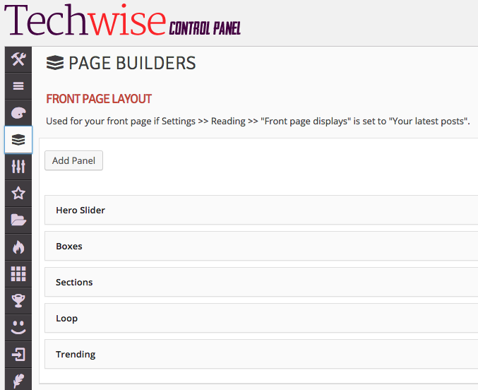
Make the following selections for the front page layout page builder:
- Hero Slider
- Boxes
- Sections
- Loop
- Trending
This will cause the front page to use five page builders in the order that you selected them. First it will display the main hero slider, followed by the two boxes below it, then the horizontal set of sections with a sidebar, then the main loop, and finally the trending slider. The header and footer will automatically display since they are set to display on every page regardless of your page builder selections. If you re-order those components they will be re-ordered on your site front-end as well, and if you added or removed more components that would also be reflected on your site front page.
Remember If you have a caching plugin active such as W3 Total Cache or WP Super Cache, making changes to theme options will require you to flush/empty your cache before they are reflected on your site’s front end.
You can further refine the settings for these page builder panels to make them display exactly how you want them to. First, expand the Hero page builder panel so that you can see all of the available options:
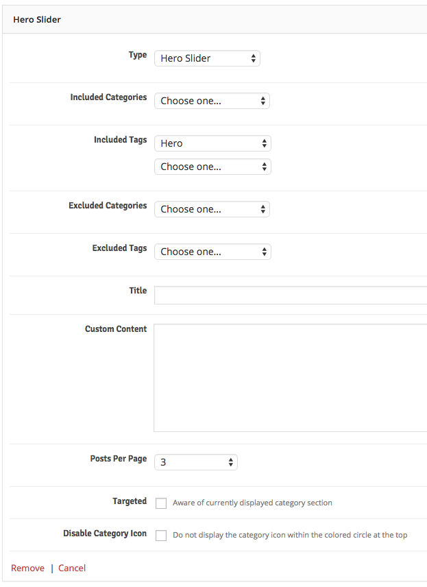
We left most of the settings as default in this example, but we did make a few selections:
- Included Tags: Hero (we previously created a hero tag and assigned it to some posts)
- Posts Per Page: 3
This will look for the latest 3 posts with the hero tag assigned and rotate through them (regardless of how many posts are actually tagged hero). If you were to leave the Included Tags unselected, it would loop through the latest 3 posts overall.
Next, expand the Boxes page builder so that you can see all of the available options:
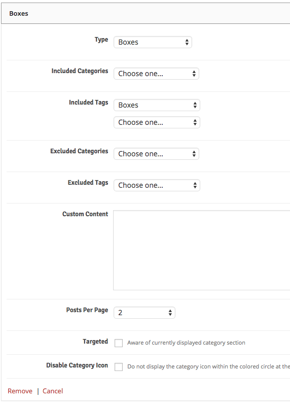
We left most of the settings as default in this example, but we did make a few selections:
- Included Tags: Boxes (we previously created a boxes tag and assiged it to some posts)
- Posts Per Page: 2
This will look for the latest 2 posts with the boxes tag assigned and display them in one horizontal row (regardless of how many posts are actually tagged boxes). If you were to leave the Included Tags unselected, it would display the latest 2 posts overall.
Next, expand the Sections page builder so that you can see all of the available options:
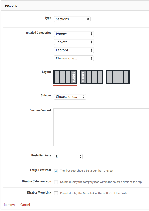
Here is an explanation of the selections we made:
- Included Categories: Phones, Tablets, and Laptops
- Posts Per Page: 5
- Large First Post: selected
This will display 3 sections of posts, from the Phones, Tablets, and Laptops categories, respectively, followed by a sidebar on the right. It will only display the latest 5 posts from each category, and the first post will be a larger format, followed by 4 smaller format posts for a total of 5 posts.
Next, expand the Loop page builder so that you can see all of the available options:
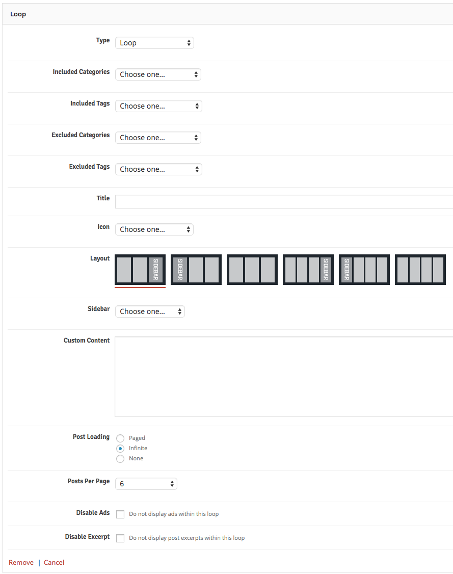
We left most of the settings as default in this example, but we did make a few selections:
- Post Loading: Infinite
- Posts Per Page: 6
This will cause 3 total rows of posts to display before the LOAD MORE button is displayed. Each time the load more button is clicked, 3 more rows will display at the end of the post loop.
Finally, expand the Trending page builder so that you can see all of the available options:
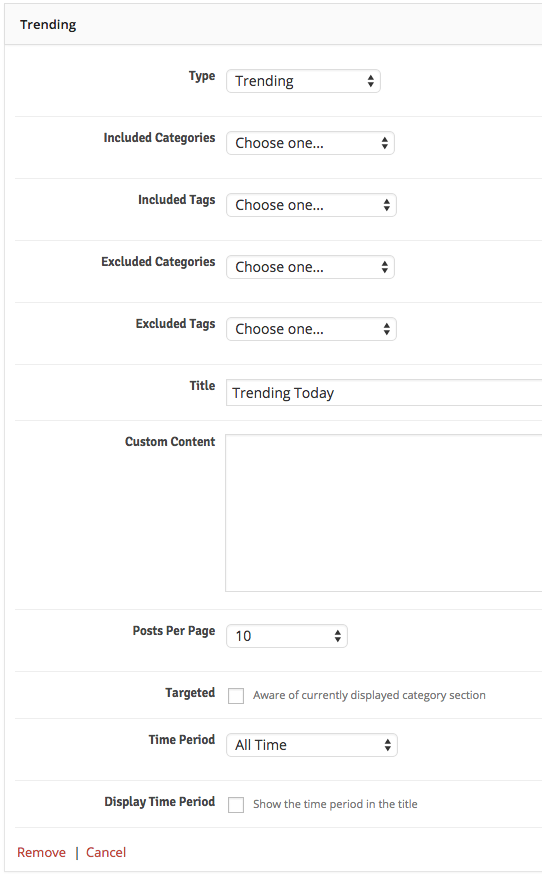
Here is an explanation of the selections we made:
- Title: “Trending Today”
- Posts Per Page: 10
- Time Period: All Time
This will display your latest 10 posts without any time period constraints. You can see here that we have “tricked” it by titling it “Trending Today” even though the posts are from all time. The reason is because the demo content is very static and will never be added to, so we didn’t want this to be blank. In your live environment it would make more sense to actually select a time period other than all time since you’ll be adding new posts to your blog.
That’s it! Your front page will now be setup just like the live demo and you are ready to move on to more of the theme’s features discussed below.
Post Loops & Pagination
Using page builders and shortcodes (discussed below) you can create any number of layouts within your site. However, there are some constant variables that apply site-wide that pertain to your post loops and pagination. It’s important to understand the scope here. We’re referring to how the post looks when it’s displayed in a loop, not what posts to display in the loop. For instance, hiding the heat index on a post, not telling a loop to display posts from the Laptops category (for the latter, see the page builders and shortcode generators sections below).
Also, since pagination options won’t change from page to page they are also contained in one place to avoid redundancy and “option bloat” (e.g. you won’t disable the next and previous arrows in pagination in one category but display it in another – that would result in an inconsistent experience for the user).
To access these settings, go to Theme Options >> Page Builders and scroll down to the bottom of the panel:
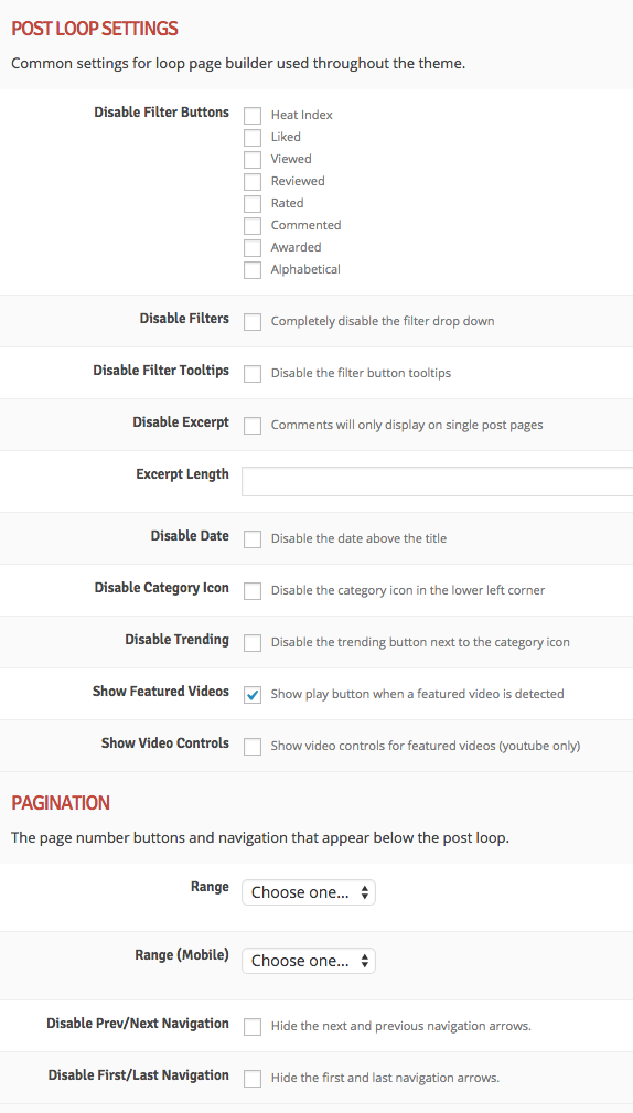
Here are some random examples of reasons you would want to access these settings:
- To hide the alphabetical sort button from the filter buttons
- To disable excerpts from displaying in the main loop
- To change the pagination number range for pagination controls
Not all of these options will specifically apply to every post loop and widget, but any relevant post loop instances will be affected by these settings. Now we will get into how to actual adjust the layout of various pages throughout our theme.
Page Builders
We have already shown how to use a few of the page builders above in the front page section, so now we will discuss the other available page builders within the theme. There are two main ways to add page builder panels to your pages:
- Theme Options: using the theme options to create and adjust page builders
- Shortcode Generator: creating shortcodes and putting them into your pages and posts (discussed in the next section)
All page builders within the theme options have at least one option at minimum: Custom Content. Use this to display HTML/text above just this instance of the page builder. This field is shortcode enabled, and accepts HTML, Javascript, and CSS.
Helpful Tip When you select the Custom Content page builder, use this field to enter the content that you want to display. For all other shortcodes this is purely an optional field.
For this example let’s say we want our standard pages to have some trending posts along with the connect social bar below the page content. And let’s also say we want to display the top ten posts from this month in the “Apps” category below the trending posts, excluding posts that have the “Editor’s Pick” tag. Here’s how we would accomplish that:
Go to the Theme Options >> Page Builders screen. We are adjusting the layout of the standard WordPress pages, so we’ll locate the Standard Page Layout section.
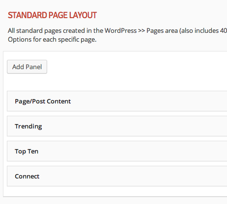
Add the following page builder panels:
- Top Ten
- Page/Post Content
- Trending
- Connect
Page/Post content does not have any settings. Think of this as a placeholder, telling the builder where you want the page content to go. If you go to the WordPress pages screen and add a new page, any content you input to that page will display in this location. So if you create an “About” page for instance, you would see the top ten posts first, then whatever content you enter into the about page, then your trending posts, then your connect bar. The top ten, trending, and connect would be the same on every page, and the page/post content would be what changes per page.
Helpful Tip You can alternatively leave your page builders completely blank for any and all page builders within the theme options, because each page has a default builder layout. So you only need to make selections here if you wish to deviate from the default layout.
Important If you do choose to build out the Standard Page Layout, Single Post Layout, or Author Listing Page Layout, you must at a minimum select Page/Post Content as one of the page builders. Failure to do so will result in none of your page content actually displaying on the page!
You can leave the Trending page builder at default settings for this example.
Expand the Top Ten page builder so that you can see all of the available settings:
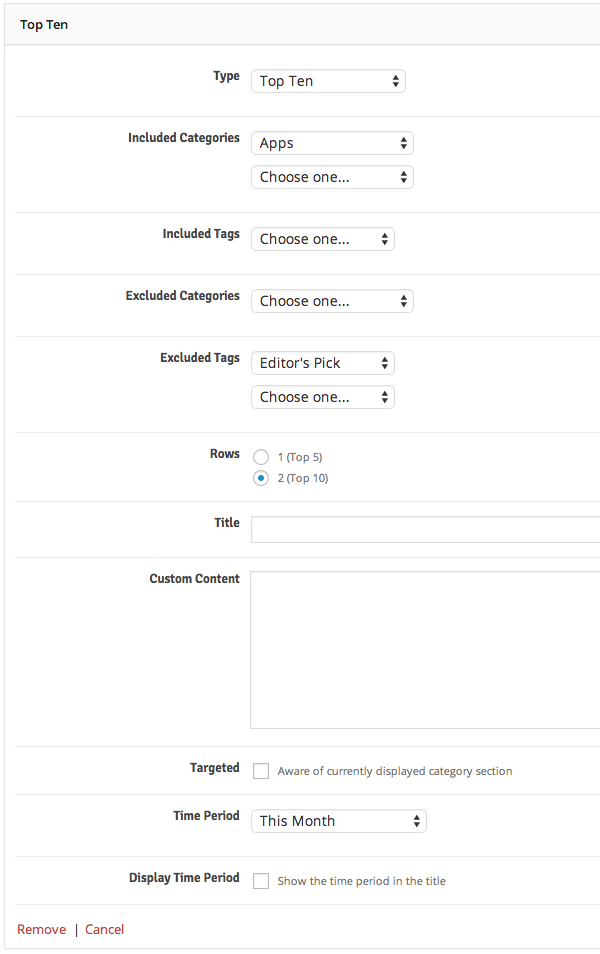
We can leave the title as default since this is auto-generated, but we need to make the following selections to match our desired criteria above:
- Included Categories: Apps
- Excluded Tags: Editor’s Pick
- Time Period: This Month
Bonus! This is really a “two-in-one” page builder since it lets you select one row instead of two, essentially turning it into a top five page builder if you want to go that route.
The category and tag limiting/excluding lists work together and not against each other. For example, if you select two limiting categories and two excluding tags, the results will include posts in either of the two limiting categories (they don’t have to be in both categories), but not in either of the two excluding tags (posts don’t have to have both tags to be excluded).
Clarification “Limiting” a category or set of categories means you want only posts within that category or set of categories to display in the results (i.e. you are limiting the results to that category or set of categories). “Excluding” a category or set of categories means you want to exclude posts within that category or set of categories from the results.
That’s the gist of the page builders in the theme options. But what if you want to have a one-off page with a custom layout? Or what if you want each of your category sections to have a different layout? All of that is discusses within the next few sections.
Shortcode Generator
The theme has a very handy and powerful shortcode generator built in. You can access it from the page and post editing pages below the post content editor. Everything you need for creating and inserting shortcodes into your content is available in one place.
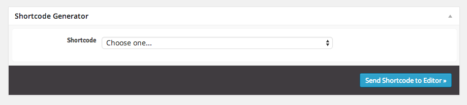
First and foremost, this is the second option for created custom page builder pages, as mentioned above in the Page Builders section. It is also used for styling your post and page content, such as adding buttons, tabs, and icons. Using the page builder shortcodes should be familiar since it follows the same technique as the Page Builders section above, but we’ll explain why you would want to use the shortcode generator for this.
Creating a one-off custom page layout
If you want to create a custom page layout that only applies to one page, you would use the shortcode generator for this. For instance, in the demo, we have a page called “Boxes, etc.” to showcase an alternate page layout that you could use for your front page or any of your other site pages. Here is how we accomplished that:
- Create the page in the Pages >> Add New screen
- Access the Text view rather than the Visual view (click the Text tab at upper-right) so that we can see our raw shortcode syntax
- Select the Custom Content shortcode from the Shortcode Generator
- Enter the following content into the Content box:
<h6>This is one of an infinite number of layouts you can create with the theme's drag and drop page builders. This could be your front page or any other page within your site.</h6> - Click Send Shortcode to Editor »
- Select the Boxes shortcode from the Shortcode Generator
- Choose the desired categories to display
- Set the number of posts to 10
- Click Send Shortcode to Editor »
- Select the Utility Menu shortcode from the Shortcode Generator
- Click Send Shortcode to Editor »
- Select the Top Ten shortcode from the Shortcode Generator
- Enter “Top Ten This Week” for the title
- Select “All Time” for the time period
- Click Send Shortcode to Editor »
- Select the Trending shortcode from the Shortcode Generator
- Enter “Trending This Week” for the title
- Set the number of posts to 10
- Select “All Time” for the time period
- Click Send Shortcode to Editor »
- Select the Connect shortcode from the Shortcode Generator
- Click Send Shortcode to Editor »
Your content editor should now look as follows:
[html]
<h6>This is one of an infinite number of layouts you can create with the theme's drag and drop page builders. This could be your front page or any other page within your site.</h6>
[/html]

[boxes included_categories="7,6" postsperpage="10"]

[menu title="Custom Menu"]

[topten rows="2" title="Top Ten This Week" timeperiod="all"]

[trending title="Trending This Week" postsperpage="10" timeperiod="all"]

[connect]
Finally, we recommend unwrapping the page for best results. This will cause each of the page builder shortcodes to be contained in their own wrapper instead of all together in the same wrapper. Select the Unwrap Page option at the bottom of the Layout Options.
Publish your page and you’re done! The beauty of shortcodes is that you can just copy and paste them anywhere you want within the theme without having to even use the shortcode generator if you want. To see what we mean, create a new page and just copy and paste in the shortcode content above – you’ll get the same result!
Creating a category front page
In addition to customizing the look and feel of each category (see section below) you can give each of your categories a unique layout. We’ll use the Gear category from the demo as an example. The idea is that you will create a page and use the shortcode generator to add page builders, which will be used as the layout for all archive pages within the category. First, create the page and use the shortcode generator to add builder panels to the page just like is described in the section above. You should end up with a page with shortcode(s), similar to this:
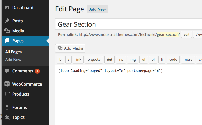
Note As you can see in this example we have named the page “Gear Section” so that it has a different page slug than the Gear category. This is to avoid any permalink confusion within WordPress. It doesn’t matter what you name this page, it’s only for internal use – it is not what is used to connect this page to the category (see below).
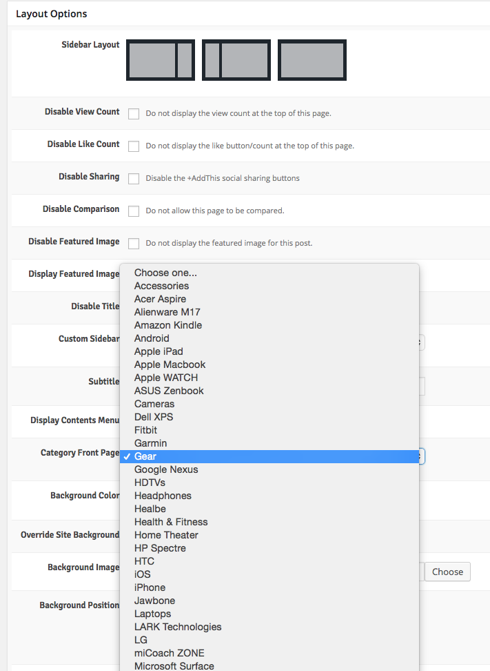
Next, you need to access the Layout Options below the shortcode generator to connect this page to the category you want to use it for:
Finally, we recommend unwrapping the page for best results. This will cause each of the page builder shortcodes to be contained in their own wrapper instead of all together in the same wrapper. Select the Unwrap Page option at the bottom of the Layout Options.
Using the shortcodes to style your content
We’ll walk through three examples from the live demo which will give you enough understanding to use the rest of the shortcodes. We’ll use the Shortcodes and Typography page present in the live demo. First we’ll do something simple and create a button. Then we’ll “popover” enable it. Finally we’ll do something a little more complicated and create a series of tabs.
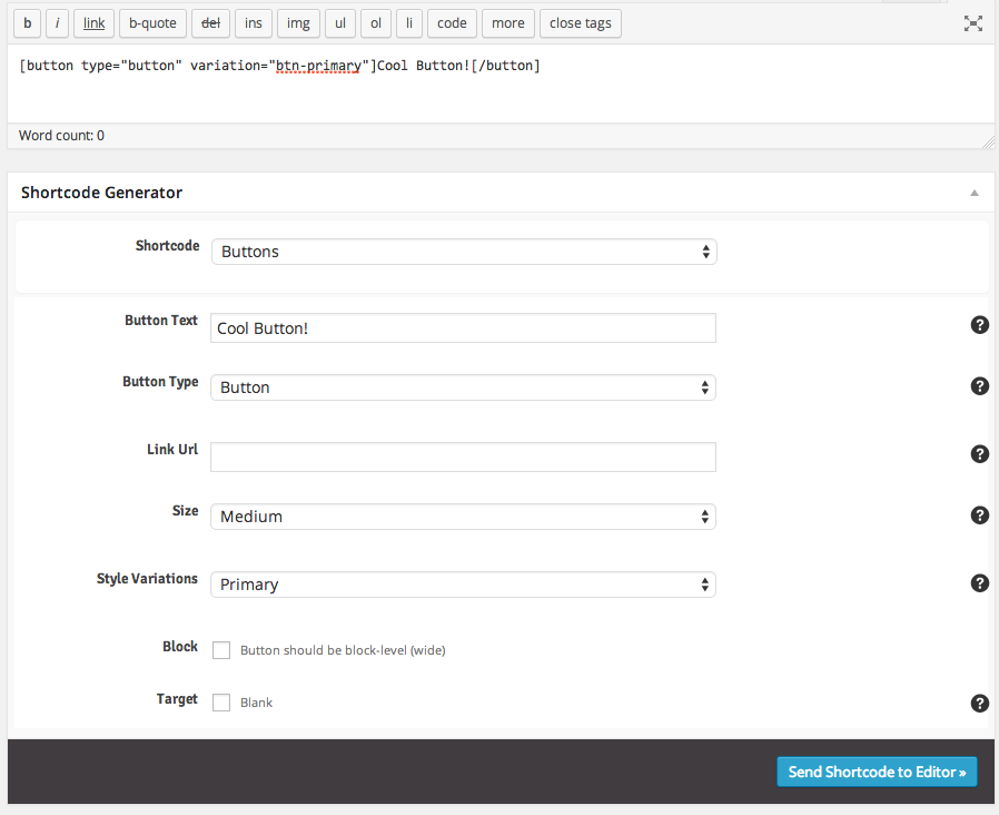
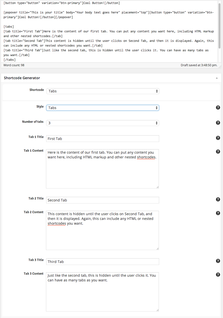
First, select Buttons from the list of shortcodes in the shortcode generator. Then add the content and make the selections as shown in the screenshot below, and click Send Shortcode to Editor » to see the resulting shortcode syntax in your post content editor (also shown in the screenshot below):
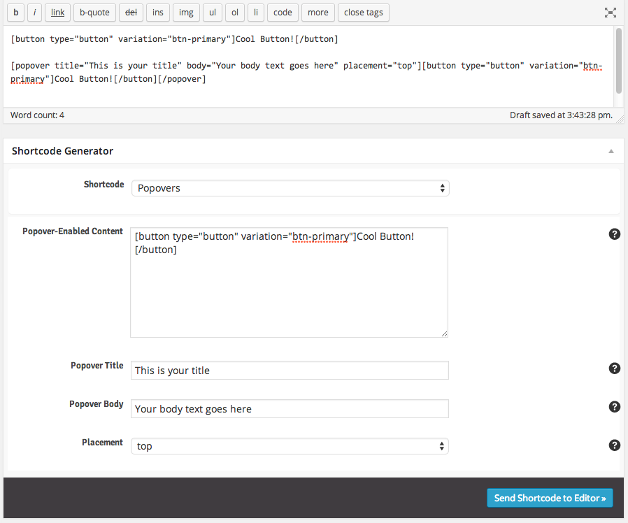
That’s all you need for a button. Now we’ll give it a popover effect. First, select the entire button shortcode in your content editor and copy it. So this is what you want to copy: .
Then, in the shortcode generator, select Popovers. Paste in the code you previously copied to the Popover-Enabled Content textbox and make the selections as shown in the screenshot below, and click Send Shorcode to Editor » again to see the second shortcode added to your content (also shown in the screenshot below):
If you save and view your post you’ll notice two buttons on the page, the first one won’t do anything, and the second one will have a popover effect. Lastly, we’ll create our tabs shortcode and add it the the post as well.
Select Tabs form the list of shortcodes and then add the content and make the selections as indicated in the screenshot below, and click Send Shortcode to Editor &arquo; to see the resulting shortcode syntax in your content editor (also shown in the screenshot below):
That’s it! The rest of the shortcodes work the same way. You just select the shortcode from the list, add/edit the options and content for the shortcode, and send it to the editor. You can nest shortcodes within other shortcodes just like the popover example above. The possibilities are endless!
Helpful Tip Once the shortcode is added to your content editor, you don’t have to use the Shortcode Generator again if you want to modify it. You can change the content or options for the shortcode directly in the content editor. Of course, if you feel more comfortable using the fool-proof generator to re-do your shortcode with the changes, it is always available to use.
You can view all of the resulting markup on the live demo shortcodes page without having to import the demo content if you need it for reference. Use the button below to expand it.
<h3>Alert Boxes</h3>

[alert variation="alert-warning" dismiss="dismiss"]Check out this awesome alert box. You can put as little or as much content within it as you want. You can even put HTML and shortcodes directly in here, and you can selectively enable and disable the Dismiss button on the right.[/alert]

[alert variation="alert-danger" dismiss="dismiss"]Check out this awesome alert box. You can put as little or as much content within it as you want. You can even put HTML and shortcodes directly in here, and you can selectively enable and disable the Dismiss button on the right.[/alert]

[alert variation="alert-success" dismiss="dismiss"]Check out this awesome alert box. You can put as little or as much content within it as you want. You can even put HTML and shortcodes directly in here, and you can selectively enable and disable the Dismiss button on the right.[/alert]

[alert variation="alert-info" dismiss="dismiss"]Check out this awesome alert box. You can put as little or as much content within it as you want. You can even put HTML and shortcodes directly in here, and you can selectively enable and disable the Dismiss button on the right.[/alert]

[divider_top]

<h3>Buttons</h3>

[button type="link" link="http://www.industrialthemes.com" size="btn-xs" variation="btn-default"]Tiny[/button][button type="link" link="http://www.industrialthemes.com" size="btn-xs" variation="btn-primary"]Tiny[/button][button type="link" link="http://www.industrialthemes.com" size="btn-xs" variation="btn-info"]Tiny[/button][button type="link" link="http://www.industrialthemes.com" size="btn-xs" variation="btn-success"]Tiny[/button][button type="link" link="http://www.industrialthemes.com" size="btn-xs" variation="btn-warning"]Tiny[/button][button type="link" link="http://www.industrialthemes.com" size="btn-xs" variation="btn-danger"]Tiny[/button]

[button type="link" link="http://www.industrialthemes.com" size="btn-sm" variation="btn-default"]Small[/button][button type="link" link="http://www.industrialthemes.com" size="btn-sm" variation="btn-primary"]Small[/button][button type="link" link="http://www.industrialthemes.com" size="btn-sm" variation="btn-info"]Small[/button][button type="link" link="http://www.industrialthemes.com" size="btn-sm" variation="btn-success"]Small[/button][button type="link" link="http://www.industrialthemes.com" size="btn-sm" variation="btn-warning"]Small[/button][button type="link" link="http://www.industrialthemes.com" size="btn-sm" variation="btn-danger"]Small[/button]

[button type="link" link="http://www.industrialthemes.com" variation="btn-default"]Medium[/button][button type="link" link="http://www.industrialthemes.com" variation="btn-primary"]Medium[/button][button type="link" link="http://www.industrialthemes.com" variation="btn-info"]Medium[/button][button type="link" link="http://www.industrialthemes.com" variation="btn-success"]Medium[/button][button type="link" link="http://www.industrialthemes.com" variation="btn-warning"]Medium[/button][button type="link" link="http://www.industrialthemes.com" variation="btn-danger"]Medium[/button]

[button type="link" link="http://www.industrialthemes.com" size="btn-lg" variation="btn-default"]Large[/button][button type="link" link="http://www.industrialthemes.com" size="btn-lg" variation="btn-primary"]Large[/button][button type="link" link="http://www.industrialthemes.com" size="btn-lg" variation="btn-info"]Large[/button][button type="link" link="http://www.industrialthemes.com" size="btn-lg" variation="btn-success"]Large[/button][button type="link" link="http://www.industrialthemes.com" size="btn-lg" variation="btn-warning"]Large[/button][button type="link" link="http://www.industrialthemes.com" size="btn-lg" variation="btn-danger"]Large[/button]

[button type="link" link="http://www.industrialthemes.com" size="btn-lg" variation="btn-default" block="btn-block"]Block Level[/button]

[button type="link" link="http://www.industrialthemes.com" size="btn-lg" variation="btn-primary" block="btn-block"]Block Level[/button]

[button type="link" link="http://www.industrialthemes.com" size="btn-lg" variation="btn-info" block="btn-block"]Block Level[/button]

[button type="link" link="http://www.industrialthemes.com" size="btn-lg" variation="btn-success" block="btn-block"]Block Level[/button]

[button type="link" link="http://www.industrialthemes.com" size="btn-lg" variation="btn-warning" block="btn-block"]Block Level[/button]

[button type="link" link="http://www.industrialthemes.com" size="btn-lg" variation="btn-danger" block="btn-block"]Block Level[/button]

[divider_top]

<h3>Progress Bars</h3>

[progress size="80" variation="progress-bar-info"]

[progress size="86" variation="progress-bar-success"]

[progress size="90" variation="progress-bar-warning"]

[progress size="95" variation="progress-bar-danger"]

[progress size="80" variation="progress-bar-info" striped="progress-striped" animated="active"]

[progress size="86" variation="progress-bar-success" striped="progress-striped" animated="active"]

[progress size="90" variation="progress-bar-warning" striped="progress-striped" animated="active"]

[progress size="95" variation="progress-bar-danger" striped="progress-striped" animated="active"]

[divider_top]

<h3>Labels & Badges</h3>

[label variation="label-default"]label[/label][label variation="label-primary"]label[/label][label variation="label-success"]label[/label][label variation="label-info"]label[/label][label variation="label-warning"]label[/label][label variation="label-danger"]label[/label]

[badge]12[/badge][badge]24[/badge][badge]badge[/badge][badge]5.3[/badge][badge]any text you want[/badge]

[divider_top]

<h3>Tooltips</h3>

[tooltip text="Voila - The Tooltip!" placement="top"][label variation="label-default"]Top Tooltip[/label][/tooltip]

[tooltip text="Voila - The Tooltip!" placement="right"][label variation="label-default"]Right Tooltip[/label][/tooltip]

[tooltip text="Voila - The Tooltip!" placement="bottom"][label variation="label-default"]Bottom Tooltip[/label][/tooltip]

[tooltip text="Voila - The Tooltip!" placement="left"][label variation="label-default"]Left Tooltip[/label][/tooltip]

[divider_top]

<h3>Popovers</h3>

[popover title="Popover Title" body="Here is the body text or content for the popover" placement="top"][button type="button" size="btn-lg" variation="btn-default"]Top Popover[/button][/popover][popover title="Popover Title" body="Here is the body text or content for the popover" placement="right"][button type="button" size="btn-lg" variation="btn-default"]Right Popover[/button][/popover][popover title="Popover Title" body="Here is the body text or content for the popover" placement="bottom"][button type="button" size="btn-lg" variation="btn-default"]Bottom Popover[/button][/popover][popover title="Popover Title" body="Here is the body text or content for the popover" placement="left"][button type="button" size="btn-lg" variation="btn-default"]Left Popover[/button][/popover]

[divider_top]

<h3>Modal Dialog Box</h3>

[modal heading="HEADING GOES HERE" footer="optional footer text" dismiss_header="dismiss_header" dismiss_footer="dismiss_footer" text="Click To Open Modal" size="btn-lg" variation="btn-primary"]

<h5>This is the body content of the modal</h5>

You can put any text that you want here, including HTML and shortcodes. For instance, here's a popover button and a progress bar:
[clear]
[popover title="Popover Title" body="Here is the body text or content for the popover" placement="top"][button type="button" size="btn-lg" variation="btn-warning"]Top Popover[/button][/popover]
[clear]
[progress size="86" variation="progress-bar-success" striped="progress-striped" animated="active"]
<h5>Some more content for fun</h5>
Mauris vehicula condimentum lorem, eleifend adipiscing magna porttitor tincidunt. Sed vel enim ullamcorper, tristique nisi et, commodo neque. Vestibulum volutpat quam vel erat adipiscing dictum. Nullam tincidunt nunc vel convallis fermentum. Donec erat lectus, vehicula sed arcu vitae, sodales tristique nibh. Praesent risus nibh, ultricies scelerisque rutrum a, molestie ac orci. Sed et cursus felis. Donec sed tristique est. Aliquam vel massa a sem aliquam bibendum. Sed in feugiat justo, vitae ultrices lacus. Aenean venenatis pulvinar congue. Aenean in lorem nec justo porttitor mattis.
[clear]
Praesent vitae orci tortor. Nunc commodo turpis nisl, et pellentesque turpis fermentum in. Sed a tellus in neque convallis eleifend. Maecenas mattis nibh id imperdiet sagittis. Cras vehicula sollicitudin velit sed blandit. Nunc fermentum metus hendrerit quam ultricies, eget cursus elit semper. Duis tincidunt nunc et facilisis faucibus. Quisque tincidunt luctus gravida. Proin aliquam et mauris id rutrum.

[/modal]

[divider_top]

<h3>Tabs</h3>

[tabs style="nav-tabs"]
[tab title="Tab 1"]Praesent vitae orci tortor. Nunc commodo turpis nisl, et pellentesque turpis fermentum in. Sed a tellus in neque convallis eleifend. Maecenas mattis nibh id imperdiet sagittis. Cras vehicula sollicitudin velit sed blandit. Nunc fermentum metus hendrerit quam ultricies, eget cursus elit semper. Duis tincidunt nunc et facilisis faucibus. Quisque tincidunt luctus gravida. Proin aliquam et mauris id rutrum.

Donec vitae orci vitae mi varius molestie. Aliquam erat volutpat. Donec faucibus urna nec accumsan tempus. Vivamus venenatis risus sed orci dictum fringilla. Vestibulum dignissim adipiscing nunc, ac eleifend mi posuere ut. Suspendisse vitae porta lectus. Nullam ut eros ac velit semper sodales sed nec sem. Ut et tincidunt felis. Curabitur aliquet iaculis erat, sit amet facilisis risus gravida eu. Curabitur consectetur elit non felis gravida congue. Curabitur quis leo est. Nam varius sed ligula in sollicitudin. Donec nisi ante, venenatis eget facilisis eu, rhoncus quis ligula. Curabitur varius, massa a fringilla condimentum, ipsum diam varius ligula, ac posuere metus neque a enim.[/tab]
[tab title="Tab 2"]Praesent vitae orci tortor. Nunc commodo turpis nisl, et pellentesque turpis fermentum in. Sed a tellus in neque convallis eleifend. Maecenas mattis nibh id imperdiet sagittis. Cras vehicula sollicitudin velit sed blandit. Nunc fermentum metus hendrerit quam ultricies, eget cursus elit semper. Duis tincidunt nunc et facilisis faucibus. Quisque tincidunt luctus gravida. Proin aliquam et mauris id rutrum.

Donec vitae orci vitae mi varius molestie. Aliquam erat volutpat. Donec faucibus urna nec accumsan tempus. Vivamus venenatis risus sed orci dictum fringilla. Vestibulum dignissim adipiscing nunc, ac eleifend mi posuere ut. Suspendisse vitae porta lectus. Nullam ut eros ac velit semper sodales sed nec sem. Ut et tincidunt felis. Curabitur aliquet iaculis erat, sit amet facilisis risus gravida eu. Curabitur consectetur elit non felis gravida congue. Curabitur quis leo est.[/tab]
[tab title="Tab 3"]Praesent vitae orci tortor. Nunc commodo turpis nisl, et pellentesque turpis fermentum in. Sed a tellus in neque convallis eleifend. elit semper. Duis tincidunt nunc et facilisis faucibus. Quisque tincidunt luctus gravida. Proin aliquam et mauris id rutrum.

Donec vitae orci vitae mi varius molestie. Aliquam erat volutpat. Donec faucibus urna nec accumsan tempus. Vivamus venenatis risus sed orci dictum fringilla. Vestibulum dignissim adipiscing nunc, ac eleifend mi posuere ut. Suspendisse vitae porta lectus. Nullam ut eros ac velit semper sodales sed nec sem. Ut et tincidunt felis. Curabitur aliquet iaculis erat, sit amet facilisis risus gravida eu. Curabitur consectetur elit non felis gravida congue. Curabitur quis leo est. Nam varius sed ligula in sollicitudin. Donec nisi ante, venenatis eget facilisis eu, rhoncus quis ligula. Curabitur varius, massa a fringilla condimentum, ipsum diam varius ligula, ac posuere metus neque a enim.[/tab]
[/tabs]

[tabs style="nav-pills"]
[tab title="Tab 1"]Praesent vitae orci tortor. Nunc commodo turpis nisl, et pellentesque turpis fermentum in. Sed a tellus in neque convallis eleifend. Maecenas mattis nibh id imperdiet sagittis. Cras vehicula sollicitudin velit sed blandit. Nunc fermentum metus hendrerit quam ultricies, eget cursus elit semper. Duis tincidunt nunc et facilisis faucibus. Quisque tincidunt luctus gravida. Proin aliquam et mauris id rutrum.

Donec vitae orci vitae mi varius molestie. Aliquam erat volutpat. Donec faucibus urna nec accumsan tempus. Vivamus venenatis risus sed orci dictum fringilla. Vestibulum dignissim adipiscing nunc, ac eleifend mi posuere ut. Suspendisse vitae porta lectus. Nullam ut eros ac velit semper sodales sed nec sem. Ut et tincidunt felis. Curabitur aliquet iaculis erat, sit amet facilisis risus gravida eu. Curabitur consectetur elit non felis gravida congue. Curabitur quis leo est. Nam varius sed ligula in sollicitudin. Donec nisi ante, venenatis eget facilisis eu, rhoncus quis ligula. Curabitur varius, massa a fringilla condimentum, ipsum diam varius ligula, ac posuere metus neque a enim.[/tab]
[tab title="Tab 2"]Praesent vitae orci tortor. Nunc commodo turpis nisl, et pellentesque turpis fermentum in. Sed a tellus in neque convallis eleifend. Maecenas mattis nibh id imperdiet sagittis. Cras vehicula sollicitudin velit sed blandit. Nunc fermentum metus hendrerit quam ultricies, eget cursus elit semper. Duis tincidunt nunc et facilisis faucibus. Quisque tincidunt luctus gravida. Proin aliquam et mauris id rutrum.

Donec vitae orci vitae mi varius molestie. Aliquam erat volutpat. Donec faucibus urna nec accumsan tempus. Vivamus venenatis risus sed orci dictum fringilla. Vestibulum dignissim adipiscing nunc, ac eleifend mi posuere ut. Suspendisse vitae porta lectus. Nullam ut eros ac velit semper sodales sed nec sem. Ut et tincidunt felis. Curabitur aliquet iaculis erat, sit amet facilisis risus gravida eu. Curabitur consectetur elit non felis gravida congue. Curabitur quis leo est.[/tab]
[tab title="Tab 3"]Praesent vitae orci tortor. Nunc commodo turpis nisl, et pellentesque turpis fermentum in. Sed a tellus in neque convallis eleifend. elit semper. Duis tincidunt nunc et facilisis faucibus. Quisque tincidunt luctus gravida. Proin aliquam et mauris id rutrum.

Donec vitae orci vitae mi varius molestie. Aliquam erat volutpat. Donec faucibus urna nec accumsan tempus. Vivamus venenatis risus sed orci dictum fringilla. Vestibulum dignissim adipiscing nunc, ac eleifend mi posuere ut. Suspendisse vitae porta lectus. Nullam ut eros ac velit semper sodales sed nec sem. Ut et tincidunt felis. Curabitur aliquet iaculis erat, sit amet facilisis risus gravida eu. Curabitur consectetur elit non felis gravida congue. Curabitur quis leo est. Nam varius sed ligula in sollicitudin. Donec nisi ante, venenatis eget facilisis eu, rhoncus quis ligula. Curabitur varius, massa a fringilla condimentum, ipsum diam varius ligula, ac posuere metus neque a enim.[/tab]
[/tabs]

[divider_top]

<h3>Icons</h3>

[tabs]
[tab title="Standard"]

<div style="color:#000;font-size:35px;">
[icons icon="acrobat"][icons icon="alert"][icons icon="appstore"][icons icon="down"][icons icon="down-bold"][icons icon="down-fat"][icons icon="down-open"][icons icon="left"][icons icon="left-fat"][icons icon="left-open"][icons icon="right"][icons icon="right-fat"][icons icon="right-open"][icons icon="up"][icons icon="up-bold"][icons icon="up-fat"][icons icon="up-open"][icons icon="attach"][icons icon="attention"][icons icon="awarded"][icons icon="basket"][icons icon="battery"][icons icon="beaker"][icons icon="book"][icons icon="bookmark"][icons icon="brush"][icons icon="builder"][icons icon="camera"][icons icon="category"][icons icon="check"][icons icon="chrome"][icons icon="cloud"][icons icon="coffee"][icons icon="commented"][icons icon="comments"][icons icon="credit-card"][icons icon="floppy"][icons icon="doc"][icons icon="dollar"][icons icon="dropbox"][icons icon="email"][icons icon="facebook"][icons icon="fire"][icons icon="firefox"][icons icon="first"][icons icon="flag"][icons icon="flickr"][icons icon="folder-open"][icons icon="food"][icons icon="footer"][icons icon="forward"][icons icon="gauge"][icons icon="cog"][icons icon="cog-alt"][icons icon="globe"][icons icon="gmail"][icons icon="googleplus"][icons icon="grid"][icons icon="html5"][icons icon="help-circled"][icons icon="home"][icons icon="ie"][icons icon="info-circled"][icons icon="instagram"][icons icon="key"][icons icon="laptop"][icons icon="last"][icons icon="lastfm"][icons icon="leaf"][icons icon="left-hand"][icons icon="cc"][icons icon="liked"][icons icon="link"][icons icon="linkedin"][icons icon="list"][icons icon="lock"][icons icon="lock-open"][icons icon="login"][icons icon="logout"][icons icon="loop"][icons icon="magnet"][icons icon="minus"][icons icon="minus-squared"][icons icon="mobile"][icons icon="monitor"][icons icon="moon"][icons icon="next"][icons icon="opera"][icons icon="pages"][icons icon="password"][icons icon="pause"][icons icon="paypal"][icons icon="pencil"][icons icon="picasa"][icons icon="picture"][icons icon="chart-pie"][icons icon="pin"][icons icon="pinterest"][icons icon="play"][icons icon="plus"][icons icon="plus-squared"][icons icon="previous"][icons icon="quote-circled"][icons icon="rss"][icons icon="random"][icons icon="recent"][icons icon="reddit"][icons icon="register"][icons icon="reviewed"][icons icon="right-hand"][icons icon="scissors"][icons icon="search"][icons icon="settings"][icons icon="sidebar"][icons icon="signal"][icons icon="signoff"][icons icon="skype"][icons icon="emo-angry"][icons icon="emo-beer"][icons icon="emo-coffee"][icons icon="emo-cry"][icons icon="emo-devil"][icons icon="emo-displeased"][icons icon="emo-grin"][icons icon="emo-happy"][icons icon="emo-laugh"][icons icon="emo-saint"][icons icon="emo-shoot"][icons icon="emo-sleep"][icons icon="emo-squint"][icons icon="emo-sunglasses"][icons icon="emo-surprised"][icons icon="emo-thumbsup"][icons icon="emo-tongue"][icons icon="emo-unhappy"][icons icon="emo-wink2"][icons icon="emo-wink"][icons icon="sort"][icons icon="spin2"][icons icon="spotify"][icons icon="star"][icons icon="star-full"][icons icon="star-half"][icons icon="star-half-empty"][icons icon="stop"][icons icon="stumbleupon"][icons icon="style"][icons icon="suitcase"][icons icon="tablet"][icons icon="tag"][icons icon="target"][icons icon="thumbs-down"][icons icon="thumbs-up"][icons icon="tools"][icons icon="trending"][icons icon="truck"][icons icon="tumblr"][icons icon="twitter"][icons icon="username"][icons icon="users"][icons icon="video"][icons icon="viewed"][icons icon="vimeo"][icons icon="water"][icons icon="wifi"][icons icon="wikipedia"][icons icon="window"][icons icon="windows"][icons icon="wordpress"][icons icon="wrench"][icons icon="x"][icons icon="yahoo"][icons icon="youtube"][icons icon="zoom-in"][icons icon="zoom-out"]
</div>

[/tab]
[tab title="Big & Purple"]

<div style="color:purple;font-size:65px;">
[icons icon="acrobat"][icons icon="alert"][icons icon="appstore"][icons icon="down"][icons icon="down-bold"][icons icon="down-fat"][icons icon="down-open"][icons icon="left"][icons icon="left-fat"][icons icon="left-open"][icons icon="right"][icons icon="right-fat"][icons icon="right-open"][icons icon="up"][icons icon="up-bold"][icons icon="up-fat"][icons icon="up-open"][icons icon="attach"][icons icon="attention"][icons icon="awarded"][icons icon="basket"][icons icon="battery"][icons icon="beaker"][icons icon="book"][icons icon="bookmark"][icons icon="brush"][icons icon="builder"][icons icon="camera"][icons icon="category"][icons icon="check"][icons icon="chrome"][icons icon="cloud"][icons icon="coffee"][icons icon="commented"][icons icon="comments"][icons icon="credit-card"][icons icon="floppy"][icons icon="doc"][icons icon="dollar"][icons icon="dropbox"][icons icon="email"][icons icon="facebook"][icons icon="fire"][icons icon="firefox"][icons icon="first"][icons icon="flag"][icons icon="flickr"][icons icon="folder-open"][icons icon="food"][icons icon="footer"][icons icon="forward"][icons icon="gauge"][icons icon="cog"][icons icon="cog-alt"][icons icon="globe"][icons icon="gmail"][icons icon="googleplus"][icons icon="grid"][icons icon="html5"][icons icon="help-circled"][icons icon="home"][icons icon="ie"][icons icon="info-circled"][icons icon="instagram"][icons icon="key"][icons icon="laptop"][icons icon="last"][icons icon="lastfm"][icons icon="leaf"][icons icon="left-hand"][icons icon="cc"][icons icon="liked"][icons icon="link"][icons icon="linkedin"][icons icon="list"][icons icon="lock"][icons icon="lock-open"][icons icon="login"][icons icon="logout"][icons icon="loop"][icons icon="magnet"][icons icon="minus"][icons icon="minus-squared"][icons icon="mobile"][icons icon="monitor"][icons icon="moon"][icons icon="next"][icons icon="opera"][icons icon="pages"][icons icon="password"][icons icon="pause"][icons icon="paypal"][icons icon="pencil"][icons icon="picasa"][icons icon="picture"][icons icon="chart-pie"][icons icon="pin"][icons icon="pinterest"][icons icon="play"][icons icon="plus"][icons icon="plus-squared"][icons icon="previous"][icons icon="quote-circled"][icons icon="rss"][icons icon="random"][icons icon="recent"][icons icon="reddit"][icons icon="register"][icons icon="reviewed"][icons icon="right-hand"][icons icon="scissors"][icons icon="search"][icons icon="settings"][icons icon="sidebar"][icons icon="signal"][icons icon="signoff"][icons icon="skype"][icons icon="emo-angry"][icons icon="emo-beer"][icons icon="emo-coffee"][icons icon="emo-cry"][icons icon="emo-devil"][icons icon="emo-displeased"][icons icon="emo-grin"][icons icon="emo-happy"][icons icon="emo-laugh"][icons icon="emo-saint"][icons icon="emo-shoot"][icons icon="emo-sleep"][icons icon="emo-squint"][icons icon="emo-sunglasses"][icons icon="emo-surprised"][icons icon="emo-thumbsup"][icons icon="emo-tongue"][icons icon="emo-unhappy"][icons icon="emo-wink2"][icons icon="emo-wink"][icons icon="sort"][icons icon="spin2"][icons icon="spotify"][icons icon="star"][icons icon="star-full"][icons icon="star-half"][icons icon="star-half-empty"][icons icon="stop"][icons icon="stumbleupon"][icons icon="style"][icons icon="suitcase"][icons icon="tablet"][icons icon="tag"][icons icon="target"][icons icon="thumbs-down"][icons icon="thumbs-up"][icons icon="tools"][icons icon="trending"][icons icon="truck"][icons icon="tumblr"][icons icon="twitter"][icons icon="username"][icons icon="users"][icons icon="video"][icons icon="viewed"][icons icon="vimeo"][icons icon="water"][icons icon="wifi"][icons icon="wikipedia"][icons icon="window"][icons icon="windows"][icons icon="wordpress"][icons icon="wrench"][icons icon="x"][icons icon="yahoo"][icons icon="youtube"][icons icon="zoom-in"][icons icon="zoom-out"]
</div>

[/tab]
[tab title="Tiny & Green"]

<div style="color:green;font-size:14px;">
[icons icon="acrobat"][icons icon="alert"][icons icon="appstore"][icons icon="down"][icons icon="down-bold"][icons icon="down-fat"][icons icon="down-open"][icons icon="left"][icons icon="left-fat"][icons icon="left-open"][icons icon="right"][icons icon="right-fat"][icons icon="right-open"][icons icon="up"][icons icon="up-bold"][icons icon="up-fat"][icons icon="up-open"][icons icon="attach"][icons icon="attention"][icons icon="awarded"][icons icon="basket"][icons icon="battery"][icons icon="beaker"][icons icon="book"][icons icon="bookmark"][icons icon="brush"][icons icon="builder"][icons icon="camera"][icons icon="category"][icons icon="check"][icons icon="chrome"][icons icon="cloud"][icons icon="coffee"][icons icon="commented"][icons icon="comments"][icons icon="credit-card"][icons icon="floppy"][icons icon="doc"][icons icon="dollar"][icons icon="dropbox"][icons icon="email"][icons icon="facebook"][icons icon="fire"][icons icon="firefox"][icons icon="first"][icons icon="flag"][icons icon="flickr"][icons icon="folder-open"][icons icon="food"][icons icon="footer"][icons icon="forward"][icons icon="gauge"][icons icon="cog"][icons icon="cog-alt"][icons icon="globe"][icons icon="gmail"][icons icon="googleplus"][icons icon="grid"][icons icon="html5"][icons icon="help-circled"][icons icon="home"][icons icon="ie"][icons icon="info-circled"][icons icon="instagram"][icons icon="key"][icons icon="laptop"][icons icon="last"][icons icon="lastfm"][icons icon="leaf"][icons icon="left-hand"][icons icon="cc"][icons icon="liked"][icons icon="link"][icons icon="linkedin"][icons icon="list"][icons icon="lock"][icons icon="lock-open"][icons icon="login"][icons icon="logout"][icons icon="loop"][icons icon="magnet"][icons icon="minus"][icons icon="minus-squared"][icons icon="mobile"][icons icon="monitor"][icons icon="moon"][icons icon="next"][icons icon="opera"][icons icon="pages"][icons icon="password"][icons icon="pause"][icons icon="paypal"][icons icon="pencil"][icons icon="picasa"][icons icon="picture"][icons icon="chart-pie"][icons icon="pin"][icons icon="pinterest"][icons icon="play"][icons icon="plus"][icons icon="plus-squared"][icons icon="previous"][icons icon="quote-circled"][icons icon="rss"][icons icon="random"][icons icon="recent"][icons icon="reddit"][icons icon="register"][icons icon="reviewed"][icons icon="right-hand"][icons icon="scissors"][icons icon="search"][icons icon="settings"][icons icon="sidebar"][icons icon="signal"][icons icon="signoff"][icons icon="skype"][icons icon="emo-angry"][icons icon="emo-beer"][icons icon="emo-coffee"][icons icon="emo-cry"][icons icon="emo-devil"][icons icon="emo-displeased"][icons icon="emo-grin"][icons icon="emo-happy"][icons icon="emo-laugh"][icons icon="emo-saint"][icons icon="emo-shoot"][icons icon="emo-sleep"][icons icon="emo-squint"][icons icon="emo-sunglasses"][icons icon="emo-surprised"][icons icon="emo-thumbsup"][icons icon="emo-tongue"][icons icon="emo-unhappy"][icons icon="emo-wink2"][icons icon="emo-wink"][icons icon="sort"][icons icon="spin2"][icons icon="spotify"][icons icon="star"][icons icon="star-full"][icons icon="star-half"][icons icon="star-half-empty"][icons icon="stop"][icons icon="stumbleupon"][icons icon="style"][icons icon="suitcase"][icons icon="tablet"][icons icon="tag"][icons icon="target"][icons icon="thumbs-down"][icons icon="thumbs-up"][icons icon="tools"][icons icon="trending"][icons icon="truck"][icons icon="tumblr"][icons icon="twitter"][icons icon="username"][icons icon="users"][icons icon="video"][icons icon="viewed"][icons icon="vimeo"][icons icon="water"][icons icon="wifi"][icons icon="wikipedia"][icons icon="window"][icons icon="windows"][icons icon="wordpress"][icons icon="wrench"][icons icon="x"][icons icon="yahoo"][icons icon="youtube"][icons icon="zoom-in"][icons icon="zoom-out"]
</div>

[/tab]
[tab title="Crazy Huge"]

<div style="color:#000;font-size:500px;">
[icons icon="firefox"]
</div>

[/tab]
[/tabs]

[divider_top]

<h3>Lists & Columns</h3>

[one_fourth][lists style="plus"]
<ul>
<li>List Item 1</li>
<li>List Item 2</li>
<li>List Item 3</li>
<li>List Item 4</li>
</ul>
[/lists][/one_fourth][one_fourth][lists style="liked"]
<ul>
<li>List Item 1</li>
<li>List Item 2</li>
<li>List Item 3</li>
<li>List Item 4</li>
</ul>
[/lists][/one_fourth][one_fourth][lists style="star"]
<ul>
<li>List Item 1</li>
<li>List Item 2</li>
<li>List Item 3</li>
<li>List Item 4</li>
</ul>
[/lists][/one_fourth][one_fourth_last][lists style="check"]
<ul>
<li>List Item 1</li>
<li>List Item 2</li>
<li>List Item 3</li>
<li>List Item 4</li>
</ul>
[/lists][/one_fourth_last]

[one_fourth][lists style="right-thin"]
<ul>
<li>List Item 1</li>
<li>List Item 2</li>
<li>List Item 3</li>
<li>List Item 4</li>
</ul>
[/lists][/one_fourth][one_fourth][lists style="right-fat"]
<ul>
<li>List Item 1</li>
<li>List Item 2</li>
<li>List Item 3</li>
<li>List Item 4</li>
</ul>
[/lists][/one_fourth][one_fourth][lists style="right-open"]
<ul>
<li>List Item 1</li>
<li>List Item 2</li>
<li>List Item 3</li>
<li>List Item 4</li>
</ul>
[/lists][/one_fourth][one_fourth_last][lists style="x"]
<ul>
<li>List Item 1</li>
<li>List Item 2</li>
<li>List Item 3</li>
<li>List Item 4</li>
</ul>
[/lists][/one_fourth_last]

[one_fourth][lists style="tag"]
<ul>
<li>List Item 1</li>
<li>List Item 2</li>
<li>List Item 3</li>
<li>List Item 4</li>
</ul>
[/lists][/one_fourth][one_fourth][lists style="help-circled"]
<ul>
<li>List Item 1</li>
<li>List Item 2</li>
<li>List Item 3</li>
<li>List Item 4</li>
</ul>
[/lists][/one_fourth][one_fourth][lists style="info-circled"]
<ul>
<li>List Item 1</li>
<li>List Item 2</li>
<li>List Item 3</li>
<li>List Item 4</li>
</ul>
[/lists][/one_fourth][one_fourth_last][lists style="attention"]
<ul>
<li>List Item 1</li>
<li>List Item 2</li>
<li>List Item 3</li>
<li>List Item 4</li>
</ul>
[/lists][/one_fourth_last]

[one_fourth][lists style="minus"]
<ul>
<li>List Item 1</li>
<li>List Item 2</li>
<li>List Item 3</li>
<li>List Item 4</li>
</ul>
[/lists][/one_fourth][one_fourth][lists style="pencil"]
<ul>
<li>List Item 1</li>
<li>List Item 2</li>
<li>List Item 3</li>
<li>List Item 4</li>
</ul>
[/lists][/one_fourth][one_fourth][lists style="thumbs-up"]
<ul>
<li>List Item 1</li>
<li>List Item 2</li>
<li>List Item 3</li>
<li>List Item 4</li>
</ul>
[/lists][/one_fourth]

[divider_top]

<h3>Tables</h3>

<strong>Default table style:</strong>

[table]
<table>
<tr>
<td>Table Cell</td>
<td>Table Cell</td>
<td>Table Cell</td>
<td>Table Cell</td>
<td>Table Cell</td>
</tr>
<tr>
<td>Table Cell</td>
<td>Table Cell</td>
<td>Table Cell</td>
<td>Table Cell</td>
<td>Table Cell</td>
</tr>
<tr>
<td>Table Cell</td>
<td>Table Cell</td>
<td>Table Cell</td>
<td>Table Cell</td>
<td>Table Cell</td>
</tr>
<tr>
<td>Table Cell</td>
<td>Table Cell</td>
<td>Table Cell</td>
<td>Table Cell</td>
<td>Table Cell</td>
</tr>
</table>
[/table]

<strong>Striped table style:</strong>

[table style="table-striped"]
<table>
<tr>
<td>Table Cell</td>
<td>Table Cell</td>
<td>Table Cell</td>
<td>Table Cell</td>
<td>Table Cell</td>
</tr>
<tr>
<td>Table Cell</td>
<td>Table Cell</td>
<td>Table Cell</td>
<td>Table Cell</td>
<td>Table Cell</td>
</tr>
<tr>
<td>Table Cell</td>
<td>Table Cell</td>
<td>Table Cell</td>
<td>Table Cell</td>
<td>Table Cell</td>
</tr>
<tr>
<td>Table Cell</td>
<td>Table Cell</td>
<td>Table Cell</td>
<td>Table Cell</td>
<td>Table Cell</td>
</tr>
</table>
[/table]

<strong>Bordered table style:</strong>

[table style="table-bordered"]
<table>
<tr>
<td>Table Cell</td>
<td>Table Cell</td>
<td>Table Cell</td>
<td>Table Cell</td>
<td>Table Cell</td>
</tr>
<tr>
<td>Table Cell</td>
<td>Table Cell</td>
<td>Table Cell</td>
<td>Table Cell</td>
<td>Table Cell</td>
</tr>
<tr>
<td>Table Cell</td>
<td>Table Cell</td>
<td>Table Cell</td>
<td>Table Cell</td>
<td>Table Cell</td>
</tr>
<tr>
<td>Table Cell</td>
<td>Table Cell</td>
<td>Table Cell</td>
<td>Table Cell</td>
<td>Table Cell</td>
</tr>
</table>
[/table]

<strong>This table has hover effect on rows:</strong>

[table style="table-hover"]
<table>
<tr>
<td>Table Cell</td>
<td>Table Cell</td>
<td>Table Cell</td>
<td>Table Cell</td>
<td>Table Cell</td>
</tr>
<tr>
<td>Table Cell</td>
<td>Table Cell</td>
<td>Table Cell</td>
<td>Table Cell</td>
<td>Table Cell</td>
</tr>
<tr>
<td>Table Cell</td>
<td>Table Cell</td>
<td>Table Cell</td>
<td>Table Cell</td>
<td>Table Cell</td>
</tr>
<tr>
<td>Table Cell</td>
<td>Table Cell</td>
<td>Table Cell</td>
<td>Table Cell</td>
<td>Table Cell</td>
</tr>
</table>
[/table]

<strong>Condensed table style:</strong>

[table style="table-condensed"]
<table>
<tr>
<td>Table Cell</td>
<td>Table Cell</td>
<td>Table Cell</td>
<td>Table Cell</td>
<td>Table Cell</td>
</tr>
<tr>
<td>Table Cell</td>
<td>Table Cell</td>
<td>Table Cell</td>
<td>Table Cell</td>
<td>Table Cell</td>
</tr>
<tr>
<td>Table Cell</td>
<td>Table Cell</td>
<td>Table Cell</td>
<td>Table Cell</td>
<td>Table Cell</td>
</tr>
<tr>
<td>Table Cell</td>
<td>Table Cell</td>
<td>Table Cell</td>
<td>Table Cell</td>
<td>Table Cell</td>
</tr>
</table>
[/table]

[divider_top]

<h3>Jumbotron</h3>

[jumbotron heading="Jumbotron Header" tagline="Here's an optional tagline"]

This is the content for the jumbotron. Anything can go here including HTML and shortcodes. Create the shortcodes first and then copy + paste them into the content of the jumbotron for easiest use. Here's a button added for fun:

[button type="link" link="http://www.industrialthemes.com" size="btn-lg" variation="btn-info"]Cool Dude[/button]

[/jumbotron]

[divider_top]

<h3>Carousel</h3>

[carousel arrows="display" buttons="display" caption="display" interval="3"]
[panel]<img src="http://www.industrialthemes.com/explicit/wp-content/uploads/2014/01/plane-1024x708.jpg" alt="plane" width="1024" height="708" class="alignnone size-large wp-image-243" />[/panel]
[panel title="Optional Slide Title" description="This slide has a description"]<img src="http://www.industrialthemes.com/explicit/wp-content/uploads/2014/01/city5-1024x708.jpg" alt="city5" width="1024" height="708" class="alignnone size-large wp-image-237" />[/panel]
[panel]<a href="http://www.industrialthemes.com/explicit/wp-content/uploads/2014/01/city6.jpg"><img src="http://www.industrialthemes.com/explicit/wp-content/uploads/2014/01/city6-1024x708.jpg" alt="city6" width="1024" height="708" class="alignnone size-large wp-image-238" /></a>[/panel]
[/carousel]

[divider_top]

<h3>Toggles</h3>

[toggles behavior="toggle"]
[toggle title="Toggle Panel 1 Title"]Praesent vitae orci tortor. Nunc commodo turpis nisl, et pellentesque turpis fermentum in. Sed a tellus in neque convallis eleifend. Maecenas mattis nibh id imperdiet sagittis. Cras vehicula sollicitudin velit sed blandit. Nunc fermentum metus hendrerit quam ultricies, eget cursus elit semper. Duis tincidunt nunc et facilisis faucibus. Quisque tincidunt luctus gravida. Proin aliquam et mauris id rutrum.

Donec vitae orci vitae mi varius molestie. Aliquam erat volutpat. Donec faucibus urna nec accumsan tempus. Vivamus venenatis risus sed orci dictum fringilla. Vestibulum dignissim adipiscing nunc, ac eleifend mi posuere ut. Suspendisse vitae porta lectus. Nullam ut eros ac velit semper sodales sed nec sem. Ut et tincidunt felis. Curabitur aliquet iaculis erat, sit amet facilisis risus gravida eu. Curabitur consectetur elit non felis gravida congue. Curabitur quis leo est. Nam varius sed ligula in sollicitudin. Donec nisi ante, venenatis eget facilisis eu, rhoncus quis ligula. Curabitur varius, massa a fringilla condimentum, ipsum diam varius ligula, ac posuere metus neque a enim.[/toggle]
[toggle title="Toggle Panel 2 Title"]Praesent vitae orci tortor. Nunc commodo turpis nisl, et pellentesque turpis fermentum in. Sed a tellus in neque convallis eleifend. Maecenas mattis nibh id imperdiet sagittis. Cras vehicula sollicitudin velit sed blandit. Nunc fermentum metus hendrerit quam ultricies, eget cursus elit semper. Duis tincidunt nunc et facilisis faucibus. Quisque tincidunt luctus gravida. Proin aliquam et mauris id rutrum.

Donec vitae orci vitae mi varius molestie. Aliquam erat volutpat. Donec faucibus urna nec accumsan tempus. Vivamus venenatis risus sed orci dictum fringilla. Vestibulum dignissim adipiscing nunc, ac eleifend mi posuere ut. Suspendisse vitae porta lectus. Nullam ut eros ac velit semper sodales sed nec sem. Ut et tincidunt felis. Curabitur aliquet iaculis erat, sit amet facilisis risus gravida eu. Curabitur consectetur elit non felis gravida congue. Curabitur quis leo est. Nam varius sed ligula in sollicitudin. Donec nisi ante, venenatis eget facilisis eu, rhoncus quis ligula. Curabitur varius, massa a fringilla condimentum, ipsum diam varius ligula, ac posuere metus neque a enim.[/toggle]
[toggle title="Last Toggle Panel"]Praesent vitae orci tortor. Nunc commodo turpis nisl, et pellentesque turpis fermentum in. Sed a tellus in neque convallis eleifend. Maecenas mattis nibh id imperdiet sagittis. Cras vehicula sollicitudin velit sed blandit. Nunc fermentum metus hendrerit quam ultricies, eget cursus elit semper. Duis tincidunt nunc et facilisis faucibus. Quisque tincidunt luctus gravida. Proin aliquam et mauris id rutrum.

Donec vitae orci vitae mi varius molestie. Aliquam erat volutpat. Donec faucibus urna nec accumsan tempus. Vivamus venenatis risus sed orci dictum fringilla. Vestibulum dignissim adipiscing nunc, ac eleifend mi posuere ut. Suspendisse vitae porta lectus. Nullam ut eros ac velit semper sodales sed nec sem. Ut et tincidunt felis. Curabitur aliquet iaculis erat, sit amet facilisis risus gravida eu. Curabitur consectetur elit non felis gravida congue. Curabitur quis leo est. Nam varius sed ligula in sollicitudin. Donec nisi ante, venenatis eget facilisis eu, rhoncus quis ligula. Curabitur varius, massa a fringilla condimentum, ipsum diam varius ligula, ac posuere metus neque a enim.[/toggle]
[/toggles]

[divider_top]

<h3>Accordion</h3>

[toggles behavior="accordion"]
[toggle title="Accordion Panel 1 Title" expanded="in"]Praesent vitae orci tortor. Nunc commodo turpis nisl, et pellentesque turpis fermentum in. Sed a tellus in neque convallis eleifend. Maecenas mattis nibh id imperdiet sagittis. Cras vehicula sollicitudin velit sed blandit. Nunc fermentum metus hendrerit quam ultricies, eget cursus elit semper. Duis tincidunt nunc et facilisis faucibus. Quisque tincidunt luctus gravida. Proin aliquam et mauris id rutrum.

Donec vitae orci vitae mi varius molestie. Aliquam erat volutpat. Donec faucibus urna nec accumsan tempus. Vivamus venenatis risus sed orci dictum fringilla. Vestibulum dignissim adipiscing nunc, ac eleifend mi posuere ut. Suspendisse vitae porta lectus. Nullam ut eros ac velit semper sodales sed nec sem. Ut et tincidunt felis. Curabitur aliquet iaculis erat, sit amet facilisis risus gravida eu. Curabitur consectetur elit non felis gravida congue. Curabitur quis leo est. Nam varius sed ligula in sollicitudin. Donec nisi ante, venenatis eget facilisis eu, rhoncus quis ligula. Curabitur varius, massa a fringilla condimentum, ipsum diam varius ligula, ac posuere metus neque a enim.[/toggle]
[toggle title="Accordion Panel 2 Title"]Praesent vitae orci tortor. Nunc commodo turpis nisl, et pellentesque turpis fermentum in. Sed a tellus in neque convallis eleifend. Maecenas mattis nibh id imperdiet sagittis. Cras vehicula sollicitudin velit sed blandit. Nunc fermentum metus hendrerit quam ultricies, eget cursus elit semper. Duis tincidunt nunc et facilisis faucibus. Quisque tincidunt luctus gravida. Proin aliquam et mauris id rutrum.

Donec vitae orci vitae mi varius molestie. Aliquam erat volutpat. Donec faucibus urna nec accumsan tempus. Vivamus venenatis risus sed orci dictum fringilla. Vestibulum dignissim adipiscing nunc, ac eleifend mi posuere ut. Suspendisse vitae porta lectus. Nullam ut eros ac velit semper sodales sed nec sem. Ut et tincidunt felis. Curabitur aliquet iaculis erat, sit amet facilisis risus gravida eu. Curabitur consectetur elit non felis gravida congue. Curabitur quis leo est. Nam varius sed ligula in sollicitudin. Donec nisi ante, venenatis eget facilisis eu, rhoncus quis ligula. Curabitur varius, massa a fringilla condimentum, ipsum diam varius ligula, ac posuere metus neque a enim.[/toggle]
[toggle title="Last Accordion Panel"]Praesent vitae orci tortor. Nunc commodo turpis nisl, et pellentesque turpis fermentum in. Sed a tellus in neque convallis eleifend. Maecenas mattis nibh id imperdiet sagittis. Cras vehicula sollicitudin velit sed blandit. Nunc fermentum metus hendrerit quam ultricies, eget cursus elit semper. Duis tincidunt nunc et facilisis faucibus. Quisque tincidunt luctus gravida. Proin aliquam et mauris id rutrum.

Donec vitae orci vitae mi varius molestie. Aliquam erat volutpat. Donec faucibus urna nec accumsan tempus. Vivamus venenatis risus sed orci dictum fringilla. Vestibulum dignissim adipiscing nunc, ac eleifend mi posuere ut. Suspendisse vitae porta lectus. Nullam ut eros ac velit semper sodales sed nec sem. Ut et tincidunt felis. Curabitur aliquet iaculis erat, sit amet facilisis risus gravida eu. Curabitur consectetur elit non felis gravida congue. Curabitur quis leo est. Nam varius sed ligula in sollicitudin. Donec nisi ante, venenatis eget facilisis eu, rhoncus quis ligula. Curabitur varius, massa a fringilla condimentum, ipsum diam varius ligula, ac posuere metus neque a enim.[/toggle]
[/toggles]

[divider_top]

<h3>Blockquote</h3>

[blockquote cite="Person's Name"]Praesent vitae orci tortor. Nunc commodo turpis nisl, et pellentesque turpis fermentum in. Sed a tellus in neque convallis eleifend. Maecenas mattis nibh id imperdiet sagittis. Cras vehicula sollicitudin velit sed blandit. Nunc fermentum metus hendrerit quam ultricies, eget cursus elit semper. Duis tincidunt nunc et facilisis faucibus. Quisque tincidunt luctus gravida. Proin aliquam et mauris id rutrum.[/blockquote]

[blockquote right="pull-right" cite="Person's Name"]Praesent vitae orci tortor. Nunc commodo turpis nisl, et pellentesque turpis fermentum in. Sed a tellus in neque convallis eleifend. Maecenas mattis nibh id imperdiet sagittis. Cras vehicula sollicitudin velit sed blandit. Nunc fermentum metus hendrerit quam ultricies, eget cursus elit semper. Duis tincidunt nunc et facilisis faucibus. Quisque tincidunt luctus gravida. Proin aliquam et mauris id rutrum.[/blockquote]

[divider_top]

<h3>Signoffs</h3>

[signoff icon="lock"]You can create one-off signoffs instead of using the theme options defined content, and you can choose any icon you want to accompany the signoff to the left. The possibilities are endless![/signoff]

[signoff icon="flag"]You can create one-off signoffs instead of using the theme options defined content, and you can choose any icon you want to accompany the signoff to the left. The possibilities are endless![/signoff]

[signoff icon="star-full"]You can create one-off signoffs instead of using the theme options defined content, and you can choose any icon you want to accompany the signoff to the left. The possibilities are endless![/signoff]

[divider_top]

<h3>Miscellaneous</h3>

<strong>Styled Ampersand:</strong>

[styled_amp size="200"][styled_amp size="150"][styled_amp size="100"][styled_amp size="50"][styled_amp size="30"][styled_amp size="20"][styled_amp size="10"]

<strong>Two paragraphs separated by a divider:</strong>

Praesent vitae orci tortor. Nunc commodo turpis nisl, et pellentesque turpis fermentum in. Sed a tellus in neque convallis eleifend. Maecenas mattis nibh id imperdiet sagittis. Cras vehicula sollicitudin velit sed blandit. Nunc fermentum metus hendrerit quam ultricies, eget cursus elit semper. Duis tincidunt nunc et facilisis faucibus. Quisque tincidunt luctus gravida. Proin aliquam et mauris id rutrum.

[divider]

Donec vitae orci vitae mi varius molestie. Aliquam erat volutpat. Donec faucibus urna nec accumsan tempus. Vivamus venenatis risus sed orci dictum fringilla. Vestibulum dignissim adipiscing nunc, ac eleifend mi posuere ut. Suspendisse vitae porta lectus. Nullam ut eros ac velit semper sodales sed nec sem. Ut et tincidunt felis. Curabitur aliquet iaculis erat, sit amet facilisis risus gravida eu. Curabitur consectetur elit non felis gravida congue. Curabitur quis leo est. Nam varius sed ligula in sollicitudin. Donec nisi ante, venenatis eget facilisis eu, rhoncus quis ligula. Curabitur varius, massa a fringilla condimentum, ipsum diam varius ligula, ac posuere metus neque a enim.

<strong>Headers</strong>

<h1>H1 Headline</h1>

<h2>H2 Headline</h2>

<h3>H3 Headline</h3>

<h4>H4 Headline</h4>

<h5>H5 Headline</h5>

<h6>H6 Headline</h6>

<pre>Praesent vitae orci tortor. Nunc commodo turpis nisl, et pellentesque turpis fermentum in. Sed a tellus in neque convallis eleifend. Maecenas mattis nibh id imperdiet sagittis. Cras vehicula sollicitudin velit sed blandit. Nunc fermentum metus hendrerit quam ultricies, eget cursus elit semper. Duis tincidunt nunc et facilisis faucibus. Quisque tincidunt luctus gravida. Proin aliquam et mauris id rutrum.</pre>

Donec vitae orci vitae mi varius molestie. Aliquam erat volutpat. Donec faucibus urna nec accumsan tempus. Vivamus venenatis risus sed orci dictum fringilla. <code>Vestibulum dignissim adipiscing nunc</code>, ac eleifend mi posuere ut. Suspendisse vitae porta lectus. Nullam ut eros ac velit semper sodales sed nec sem. Ut et tincidunt felis. Curabitur aliquet iaculis erat, sit amet facilisis risus gravida eu. Curabitur consectetur elit non felis gravida congue. Curabitur quis leo est. Nam varius sed ligula in sollicitudin. Donec nisi ante, venenatis eget facilisis eu, rhoncus quis ligula. Curabitur varius, massa a fringilla condimentum, ipsum diam varius ligula, ac posuere metus neque a enim.

[caption id="attachment_235" align="alignleft" width="300"]<a href="http://www.industrialthemes.com/explicit/wp-content/uploads/2014/01/city3.jpg"><img src="http://www.industrialthemes.com/explicit/wp-content/uploads/2014/01/city3-300x207.jpg" alt="Here's a caption" width="300" height="207" class="size-medium wp-image-235" /></a> Here's a caption[/caption]

Donec rutrum, tellus vulputate aliquet scelerisque, elit nunc facilisis tellus, nec commodo purus tellus bibendum arcu. Praesent auctor condimentum congue. Pellentesque habitant morbi tristique senectus et netus et malesuada fames ac turpis egestas. Maecenas a sem et tellus aliquam imperdiet. Mauris eget diam justo. Sed sem sapien, malesuada in egestas sed, lacinia at ipsum. Sed egestas, mi eu imperdiet blandit, felis erat convallis turpis, a tincidunt nisl justo ac nunc. Nullam quis convallis ipsum. Etiam fringilla lectus erat, eu lobortis mauris volutpat sit amet.

Donec rutrum, tellus vulputate aliquet scelerisque, elit nunc facilisis tellus, nec commodo purus tellus bibendum arcu. Praesent auctor condimentum congue. Pellentesque habitant morbi tristique senectus et netus et malesuada fames ac turpis egestas. Maecenas a sem et tellus aliquam imperdiet. Mauris eget diam justo. Sed sem sapien, malesuada in egestas sed, lacinia at ipsum. Sed egestas, mi eu imperdiet blandit, felis erat convallis turpis, a tincidunt nisl justo ac nunc. Nullam quis convallis ipsum. Etiam fringilla lectus erat, eu lobortis mauris volutpat sit amet.

Donec rutrum, tellus vulputate aliquet scelerisque, elit nunc facilisis tellus, nec commodo purus tellus bibendum arcu. Praesent auctor condimentum congue. Pellentesque habitant morbi tristique senectus et netus et malesuada fames ac turpis egestas. Maecenas a sem et tellus aliquam imperdiet. Mauris eget diam justo. Sed sem sapien, malesuada in egestas sed, lacinia at ipsum. Sed egestas, mi eu imperdiet blandit, felis erat convallis turpis, a tincidunt nisl justo ac nunc. Nullam quis convallis ipsum. Etiam fringilla lectus erat, eu lobortis mauris volutpat sit amet.

[caption id="attachment_234" align="alignright" width="300"]<a href="http://www.industrialthemes.com/explicit/wp-content/uploads/2014/01/city2.jpg"><img src="http://www.industrialthemes.com/explicit/wp-content/uploads/2014/01/city2-300x207.jpg" alt="I love captions, you?" width="300" height="207" class="size-medium wp-image-234" /></a> I love captions, you?[/caption]

Donec rutrum, tellus vulputate aliquet scelerisque, elit nunc facilisis tellus, nec commodo purus tellus bibendum arcu. Praesent auctor condimentum congue. Pellentesque habitant morbi tristique senectus et netus et malesuada fames ac turpis egestas. Maecenas a sem et tellus aliquam imperdiet. Mauris eget diam justo. Sed sem sapien, malesuada in egestas sed, lacinia at ipsum. Sed egestas, mi eu imperdiet blandit, felis erat convallis turpis, a tincidunt nisl justo ac nunc. Nullam quis convallis ipsum. Etiam fringilla lectus erat, eu lobortis mauris volutpat sit amet.

Praesent vitae orci tortor. Nunc commodo turpis nisl, et pellentesque turpis fermentum in. Sed a tellus in neque convallis eleifend. Maecenas mattis nibh id imperdiet sagittis. Cras vehicula sollicitudin velit sed blandit. Nunc fermentum metus hendrerit quam ultricies, eget cursus elit semper. Duis tincidunt nunc et facilisis faucibus. Quisque tincidunt luctus gravida. Proin aliquam et mauris id rutrum.

<strong>Lightbox-enabled Image Gallery:</strong>

[gallery link="file" ids="160,155,128,121,120,114"]

[divider_top]
Category Sections
This theme allows you to customize your site’s categories in many ways in order to give your site a “sectional” approach. In order to turn a category into a section, you need to create in your list of WordPress categories in your Posts >> Categories screen. Once the category exists you will be able to manage it in the theme options. As in our other examples we’ll use the live demo for example purposes. So in this case, you need to make sure you have the following categories created in your list of WordPress categories:
Remember while this screenshot is from the theme options, this example actually requires that you add them in the Posts >> Categories screen first. The screenshot is just for simplicity sake.
Now, go to Theme Options >> Categories and you will see the Manage A Category button. Click that button and then choose Gear from the list of categories, and then enter the following content and options for that category:
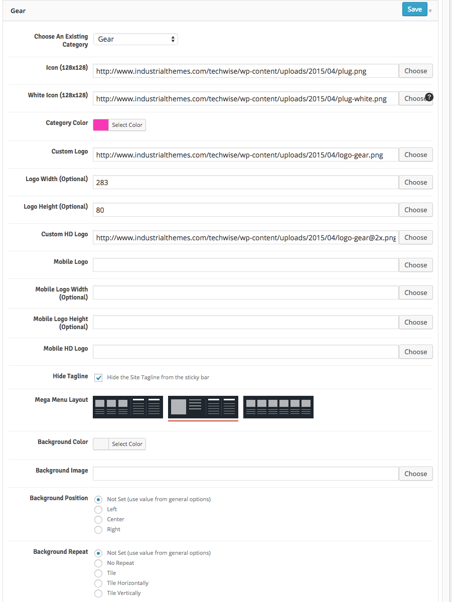
Click Save to save the options. The Gear category is now setup just like the live demo. You can do the same with the other categories mentioned above and choose whatever colors, logos, and icons you want. If you want to get the ones from the live demo, you should import the full live demo content according to the steps located at the top of this documentation.
When you view posts within one of these categories, or the archive listing page for these categories (or any subcategories therein) you will notice the logo, icon, colors, etc. will match the settings you chose above. If you add these categories to your mega menu you will notice they will automatically display using the selected color/icon and will populate with posts within that category and even subcategories of that category within the mega menu panels. This is further explained in the next section.
Custom Menus
There are three custom menu locations within the theme, including:
- The Top Menu
- The Section menu
- The Main menu
- The Utility menu
The section menu is the only one of the three that can be mega menu enabled. Both the section and main menus display in the sticky bar. The main menu displays below the logo, and the section menu displays to the right of it. The utility menu is used by the page builder of the same name and can be put anywhere in your site. Go to the Theme Options >> Header screen to see all options pertaining to menu placement and functionality.
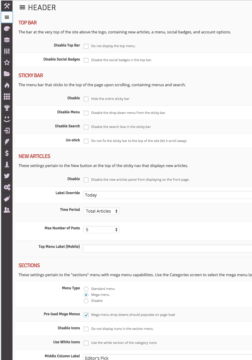
We’ll set up the menu structure just like the live demo. You want to make sure you have the Sections menu set to “mega menu”. Once you have the settings how you want them in the theme options, the next thing to do is go and actually create and assign your menus in the Appearance >> Menus screen.
Create three menus, one called Section Menu, one called Main Menu, and one called Top Menu. Then choose the section menu from the drop down and click Select. Add the first five categories that we setup in the manage categories section in the theme options from our previous step, as shown here:
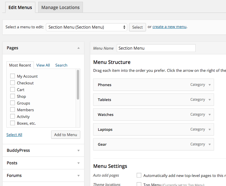
Next, choose the main menu from the drop down and click Select. Add anything you want to this menu, it is not mega enabled and will display any pages, categories, tags, or custom links you want to add. Of course you are not required to use this menu if you want to use only the section menu above. Do the same thing for the top menu.
Helpful Tip If you want menu items to have their own sub menu items, drag the menu item slightly to the right to indent it under its parent item, and it will be rendered as a drop down sub menu item on your site. You can do this multiple levels deep as needed.
The final, most important step is to assign the menu locations. Click the Manage Locations tab at the top and assign the four menu locations as shown in the screenshot:
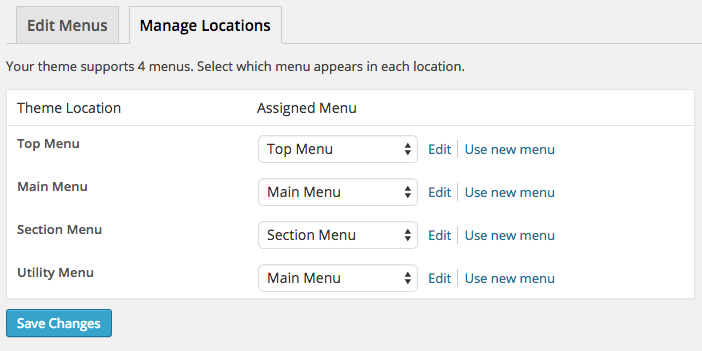
You can of course create a fourth menu specifically for the Utility Menu, but we chose to re-use the main menu in both spots for the sake of simplicity. Whatever you have selected for the utility menu is what will display wherever you choose “utility menu” in any page builder setup.
Awards and Badges
This theme comes with a built-in awards and badges system that does not require any third-party plugins. The icons and names of the awards and badges are custom assigned by you and there are no pre-packaged awards or badges (unless you import the demo content). We’ll show you how to add a few awards and badges and assign them to your posts.
There are two steps to getting awards and badges to show up on your site:
- Creating your awards and badges within the theme options
- Assigning them to your various posts
Info Unlike some of our previous themes, awards and badges will be fully functional on all of your posts, not just posts marked as reviews.
First let’s create a few awards and badges. Go to Theme Options >> Awards and Badges and click the Add New Award button to create a new award or badge. Then fill in the options for each one following the in-line help tips. Here’s a screenshot from the demo theme options:
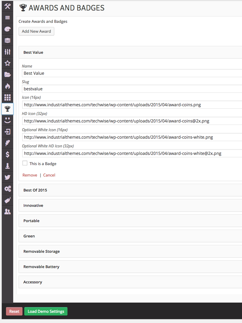
Next open up a new post and notice the list of possible awards and badges to assign on the bottom right of the screen as shown in the screenshot below. Just select which award(s) and badge(s) you want to assign to this post, and they will appear on the front-end of your site – it’s as easy as that!
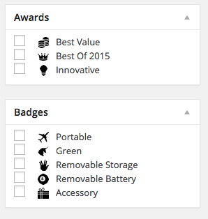
In the live demo there are several more awards and badges, but they are all added and managed the same way, so we have only shown the expanded options for one of them for the sake of brevity here. If you want all awards and badges from the demo feel free to import the demo content as is instructed towards the top of this documentation.
Reactions
This theme comes with a built-in user reactions component that does not require any third-party plugins. The reactions are a way for users to voice their immediate reaction to the article they have just read, and to display the results at the end of your articles for all users to see. It’s fully AJAX-enabled and updates immediately for ease of use and UX.
There are a set of 20 pre-defined emoticons to use for the icons for each reaction that span the spectrum of emotions (for the most part), but you can easily upload your own icons to use for the reactions (or just use text with no icon if you want). We tried to name each of the preset icons according to its corresponding emotion, so you should be able to get away with just matching the name to the reaction as is shown in the following screenshot:
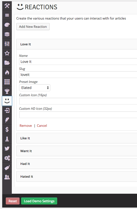
Once you create all of your reactions, they will automatically become available for users to click on at the end of all of your posts. You can exclude certain reactions from specific posts if they don’t apply very easily. To do so edit a post and locate the Excluded Reactions panel at the bottom right of the screen. If you want to exclude a certain reaction from the post, just select it in the list and save the post. That reaction will no longer be available in the list of possible reactions for just that post.
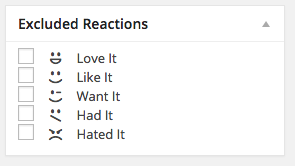
Helpful Tip You can move the location of the reactions on single posts easily using the theme options, as you can do with many other components as well. Just go to Theme Options >> Template Setup >> Single Posts >> Reactions Position
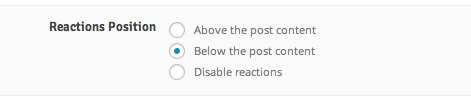
Comparisons
The comparison feature allows you to compare two or more items all on the same page. It can show any and all information about the posts, from title and featured image, to details, rating criteria, and even meta information like number of comments, likes, and views.
Adding to comparison queue:
You can add items to the comparison queue by clicking the Compare… toggle button in the post loops or on individual post pages:
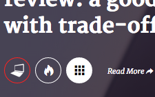
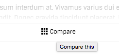
Removing from comparison queue:
You can remove items from the comparison table by clicking the Compare… button again to untoggle it, or by clicking on the title in the comparison “dock” at the bottom of the window, or even directly on the comparison page by hovering over the title and clicking the ×:
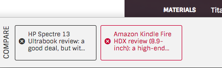
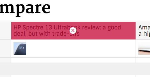
Setting up the comparison system:
To turn on the comparison system, specify which post information is compared, and adjust other global settings pertaining to comparisons, access the Comparison tab in the theme options:
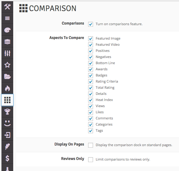
Next, create a new page and title it whatever you want (we suggest something like “Comparison” or “Compare”). Then select Comparison for the page template, and publish the page:
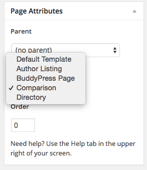
That’s all you need to do. Clicking “Go” in the compare panel (after you add a few items to compare) will automatically find your compare page and generate the table there.
Info You can also disable comparisons on a per-post or per-page basis in the Layout Options below the content editor.
Heat Index
The heat index feature lets you define rules for how a post obtains a heat index. It’s a way for you to find the total popularity of a post by taking into account not only it’s views or likes, but everything together, including number of comments, number of views, number of likes, number of user ratings, and number of user reactions. It also assigns heat indexes to categories and tags based on the posts within them in a certain time period (optional). You can then use widgets to display your trending topics (categories and tags).
To define your heat index rules, go to Theme Options >> Heat Index and you will see the following defaults in place:
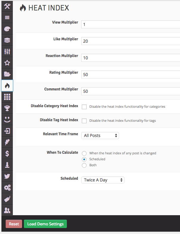
Each post starts off with a heat index of 0 which then increments based on the users’ action. If a post is viewed one time by one user, its heat index will become 1. If it’s viewed by 5 users and two users click the like button, its heat index will become 45 (20 * 2 plus 1 * 5).
You can turn off heat indexes for categories and tags if you wish to only use them for posts. You can also set up rules to automatically calculate the category/tag heat indexes on a schedule, or even every time a heat index changes.
Info For single posts the heat index is stored in a custom field. For categories and tags the heat index is stored in the category/tag description field. If you overwrite this field with a description or change the value, the category/tag will lose its index (but you can manually reset it to whatever you want it to be.)
Warning Setting the “When to calculate” frequency to “When the heat index of any post is changed” or “Both” will potentially be taxing on your server resources, especially if you have a lot of users. We recommend this setting only for sites with less traffic, or sites with more server resources, or for temporarily manually rebuilding your heat indexes without having to wait for the scheduled batch.
Custom Sidebars
You can easily create unlimited sidebars to be used individually for specific posts and pages if you want. It entails three steps:
- Create the sidebar
- Add widgets to the sidebar
- Assign the sidebar to a post, page, or page builder panel
First, to create the sidebar, go to Theme Options >> Custom Sidebars and enter the name of your sidebar and click Add Sidebar. It will then appear in your list of custom sidebars as shown in the following screenshot:
Once you have created the sidebar it will become available to add widgets to in the Appearance >> Widgets screen. Now you can add widgets to the sidebar just like any other existing pre-build sidebar, as shown in the following screenshot:
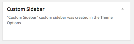
Finally, you can assign this custom sidebar to any and all posts or pages. Open a post and locate the Layout Options panel below the post content editor. Within this panel you’ll see an option for a Custom Sidebar. All of the custom sidebars you have created in your theme options will appear in this list. Just choose which one you want to use for this post and it will be used instead of the standard post sidebar.
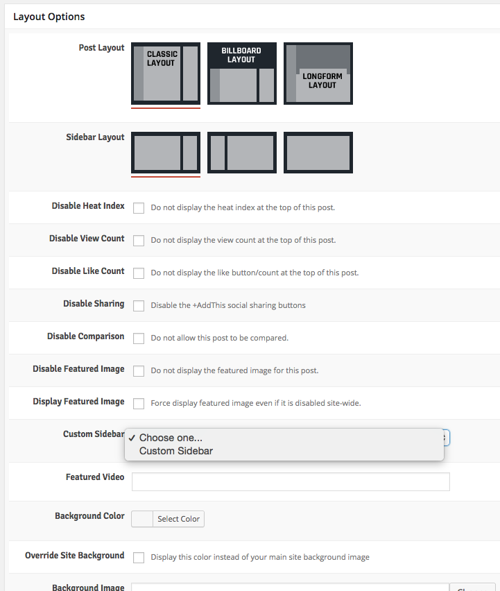
Info The custom sidebars are a one-to-many relationship with posts, pages, and page builders. That is, you can assign any one custom sidebar to as many pages, posts, or page builders as you wish.
Custom “Signoffs”
You can create an unlimited number of custom “signoff” boxes. A signoff is a way of putting standard content at the end of each of your posts, such as information about how to contact the editor, or a disclaimer of some kind. It’s really a catch-all for any content that you want at the end of every post. However since you can create as many as you want, you can have different groups of standardized content, showing one signoff on certain posts and a different signoff on other posts. The beauty and benefit of the signoff is that you don’t have to re-write the signoff for each post. You do it once in the theme options and then add it (via a shortcode) to any post or page you wish. You can even specify one-off signoffs directly within each post if you so desire.
First, create the signoff. We’ll use the one from the live demo here. Go to Theme Options >> Signoffs and add a new signoff called Custom Signoff Box with the content as indicated int he screenshot below:
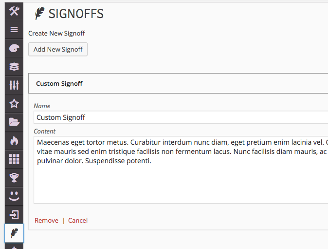
You can of course create more than one, but we’ll just create one for example purposes. Next, go to any post and locate the Shortcode Generator under the post content editor and choose the Signoffs shortcode. Then select the custom signoff you created in the theme options (all signoffs you create will display in the drop down here). Leave the custom content blank and select any icon you want to use to highlight the signoff, and click Send Shortcode to Editor » as is shown in this screenshot:
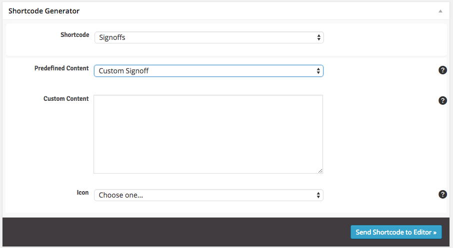
Info To overwrite the pre-defined signoff with custom one-off text for just this instance of the signoff shortcode, enter your content into the Custom Content textbox. You can still select an icon to use if you go this route.
Review System
The theme comes with a robust review system with four different metrics and the ability to add extra details to your posts, including positives, negatives, and a bottom line. You can review-enable any standard post without worrying about any complicated conversion processes or custom post types. Here’s how we did it in the live demo.
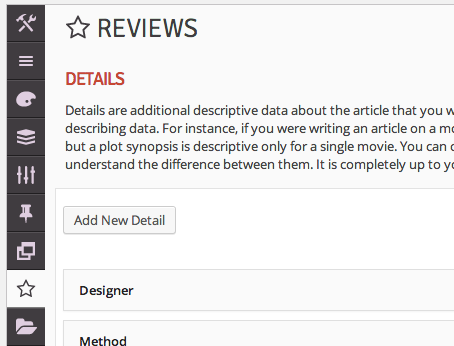
First, access the review settings in the Theme Options >> Reviews panel. Then add your details and rating criteria here. Choose Numbers as the metric to use. Add all of the possible rating criteria you will ever want to use on any of your posts here and then you can selectively add them to each post. They will not all display on every post by default. You can always come back later and add in new rating criteria to assign to your posts.
Info The metric you choose in theme options does not limit you only to using that metric for your whole site, it’s just a default. You can selectively use a different metric on a per-post basis in the Review Options panel if you want.
Here are the criteria we added in the live demo. We left the weight blank for each of the criteria, but if you want a criteria to have more weight in the auto-averaging of the total score, give them all relative weights.
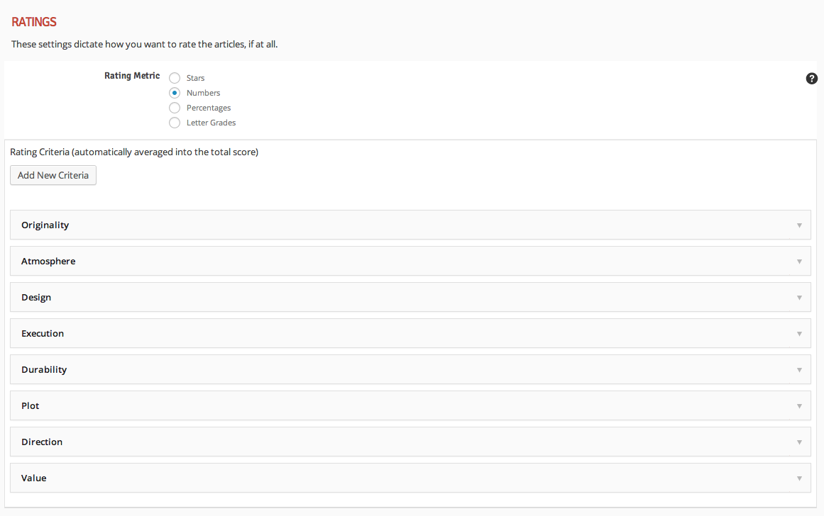
We also added various details as well. Add whatever you want for your details fields. They are similar to criteria in that they only display on the post if you have entered content (i.e. leave them blank to exclude them) but they obviously don’t carry any rating value, they are purely informational (and optional as well).
Now go to any post and notice the available rating criteria in the Review Options panel below the content editor. Enter positives, negatives, and a bottom line for the review, and then make your rating criteria selections. Only select values for the criteria that you want to use for the post and leave the rest set as Choose One… or No Rating.
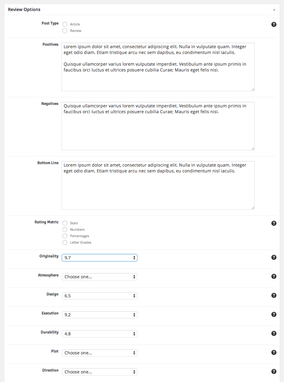
Helpful Tip You can selectively exclude editor ratings! Just select Users can rate (no editor rating) and that will allow users to rate that criteria on the front-end while not displaying anything for the editor rating for that criteria.
Info To disable the positives or negatives for a specific post, just leave the field blank and the theme will completely hide that area.
You can override the auto-averaged total editor rating if you want to. To do so, just select a value for the Total Score Override option at the bottom of the list of rating criteria. This is the value that will be displayed to the user for the total rating of this review, regardless of what values are selected for the rating criteria.
You can reset user ratings for a specific post if you want to. To do so, scroll to the very bottom of the post edit screen and find the Reset Values panel and choose the Delete User Ratings option and then save the post. You can do the same with resetting likes, view counts, and user reactions as well using this panel.
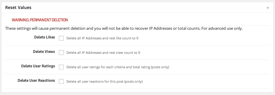
Info Regardless of which rating metric you choose, the results will be rendered correctly for rich snippet search results based on a 100 point scale (this is called “normalizing” the values, and the theme completely takes care of it for you)
In-Post “Contents” Menus
You can easily organize your posts using what are known as Contents Menus using shortcodes. This will create a contents menu that displays on your posts that lets the user navigate around the various sections of it. This is useful for very long and involved posts, especially using the Longform post format, and is especially useful for review posts with many sections of content.
The first step is to adjust the display behavior of the contents menu within posts. You can set it to display for all posts, only review posts, only posts that you specifically tell it to display on, etc. To do so, go to the Theme Options >> Template Setup screen.
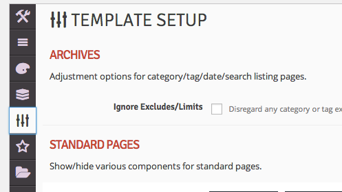
Then scroll down to the Single Posts section and find the Contents Menu Behavior section. If you want it to display for all posts, choose the first option just like the live demo.
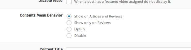
Now you will notice without having to do anything else the contents menu will display on all of your posts with some pre-packaged helpful links, such as an anchor link directly to the comments of the post. However, you’ll want to add even more custom links to the menu for each post. This is a very simple process and is done using purely shortcodes. Open a post in edit view and choose the Content Section shortcode from the list of shortcodes in the shortcode generator. Then add the link label and click Send Shortcode to Editor » and the shortcode will appear in your content editor as is shown in the following screenshot:
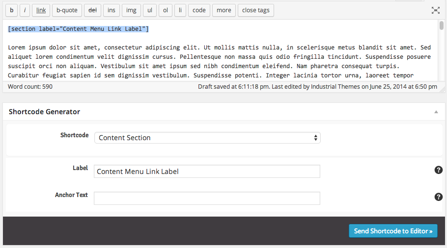
So the shortcode syntax for any content section is . The label corresponds to what displays in the actual contents menu – it’s the menu item the user clicks on to be taken to that section. It is not what displays in the actual content – that is up to you. For instance, put a header right underneath the shortcode with matching text if you want that section of your content to have a header that matches the contents menu label. This is purely a means of separating your content so the contents menu can find the various sections.
Helpful Tip Using Cyrillics or other special characters in the names of your contents menu labels? Not to worry, just specify a non-Cyrillic value for the Anchor Text of the menu item. This will not display to the user, it is only used for anchor linking purposes.
Info There is no limit to the number of sections you can add to the contents menu, other than the limitation of the users’ vertical screen viewport height (since the contents menu lists items vertically).
Directory Builder
One of the most powerful features in in the theme is the directory builder. You can create any kind of category directory listing on any specific page with any layout using the Directory page template. And best of all, it’s a very simple two step process. We’ll use the “Directory – Alphabetical” page, which is one of the directories present in the live demo. The first thing to do is create the page and assign the Directory page template as is shown in the screenshot:
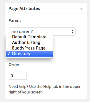
Then locate the Directory Options panel underneath the layout options panel. You’ll notice many options you can control, such as which categories to include, the type, style, and layout of the directory, default sorting, posts per page, etc. Setup this particular directory page to match the options in the screenshot:
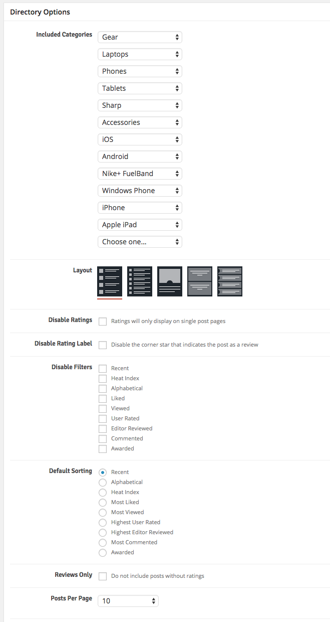
To recap, we have selected our desired section categories created previously with Layout A. We have set the default sorting to Recent (but since we didn’t disable any filters the user can adjust the sorting on the front end). We could have selected only posts with reviews to effectivaly create a review directory within our site. Or we could have created a separate directory page for each of these categories if we preferred.
Info You do not need to enter any content into the page content editor. However any content you do enter will display above the directory listing.
That’s it! It’s as easy as that to create a directory, and you can create as many of them as you want to. The possibilities are endless. To get all of the directories you see in the live demo, you can import the demo content as is described towards the top of the documentation. All of the rest of the directories are created in this same fashion, just with different options selected in the Directory Options panel
Ad Management
There are a myriad of ad spots within the theme. All of the ad slot locations are fully compatible with HTML syntax, shortcodes, ad vendors such as Adsense, and even responsive ad units. You can see in the Theme Options >> Ads screen they are separated into four main categories:
- General
- Page Builders
- Single Posts/Pages
- Post Loops
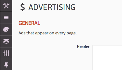
The general section contains ads that display on all pages throughout the site and is made up of the header ad and the footer ad. The page builders section contains ads that display above and below each instance of a page builder, which means these ads will only display on pages where there is a corresponding page builder. The single posts/pages section contains ad slots that display within single post and page content, such as after the post title, featured image, content, comments, etc. And finally the post loops section contains a sophisticated mechanism for inserting ads within your post loops. The first three are self-evident, but the post loops section having more functionality requires some explanation.
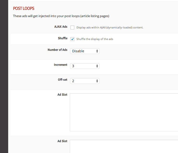
Each ad slot will show up between a row within the loop. You should enter ad content into at least as many ad slots as you have selected for Number of Ads. If you offset the ads, the first add will not display until after x number of rows of posts have been displayed, and then after that it will display an ad after x number of incremented rows. So if you have the offset at 2 and the increment at 4, it will display an ad after the second row and then after every 4 rows thereafter.
The AJAX ads option is so you don’t end up with blank ad spots on subsequent pages if you’re using an ad vendor that does not allow their ads to be displayed in dynamic content (such as Google adsense). You can safely turn on this setting if you are using any other ads, such as standard image/HTML ads.
Post Layouts
One of the features that makes this theme so unique is the ability to create three different overall styles of posts, including Classic, Billboard, and Longform. Both classic and billboard layouts are capable of displaying sidebars on the right if you want. Longform is a new theme feature and is for a more in-depth reading experience for the user, simplifying the layout and focusing on the art of writing by getting rid of the sidebar, adding more margin/padding to the content, and using a larger font for the content. All three layouts display the contents menu on the right for easy access. Billboard shows a much larger image and title at the top than classic, but doesn’t expand the body copy as much as longform, so it’s convenient if you want to highlight the title and image of the post, but then present a standard post reading experience thereafter.
You can set your site-wide post layout in the Theme Options >> Template Setup >> Single Posts screen using the Layout option as is shown in the screenshot below:
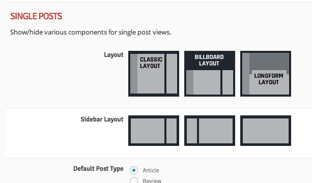
You can additionally specify a layout to be used for each specific post using the Layout Options below the post content editor. You’ll notice many other options available in these places as well which manipulate the layout and style of the post, such as display of the sidebar, subtitle, featured videos, etc.
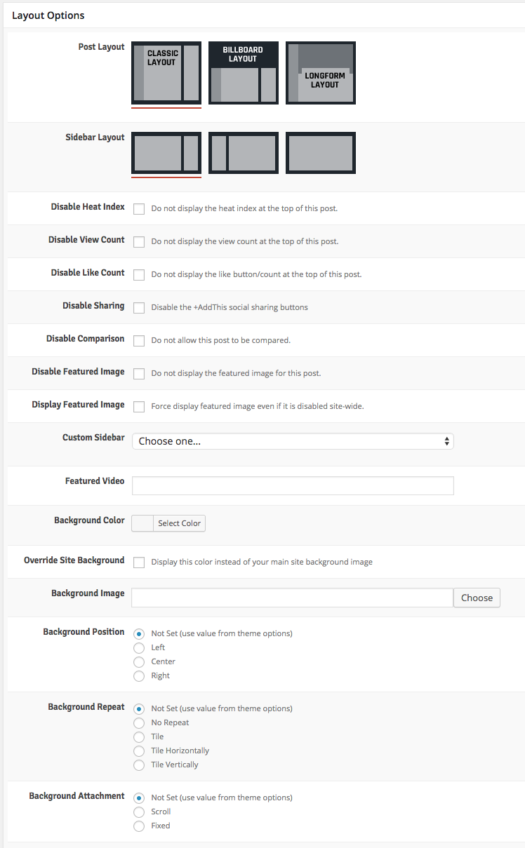
WooCommerce, BuddyPress, and bbPress
This theme comes with full style/skinning for three of the most widely used WordPress plugins: WooCommerce, BuddyPress, and bbPress. Nothing special is required in order to get the theme up and running with any or all of these plugins. You can see how a live environment of these plugins is setup in the live theme demo here:
Install these plugins according to their standard installation instructions. Once you have installed any of these plugins, you’ll notice in the theme options that a new panel is created giving you some options to control how pages within the plugins display. Both the BuddyPress and WooCommerce theme options tabs are added to the bottom of the list of existing tabs.
Using these tabs you control the layout of pages within the plugins. For instance the shop and checkout pages within WooCommerce, the activity and group pages within BuddyPress, and the forum pages within bbPress. One of the options you have control over is whether unique sidebars are used for these plugins. If you select the unique sidebars to display you’ll be able to add widgets to them using the Appearance >> Widgets screen just like if you were to create a custom sidebar as described in the previous section.
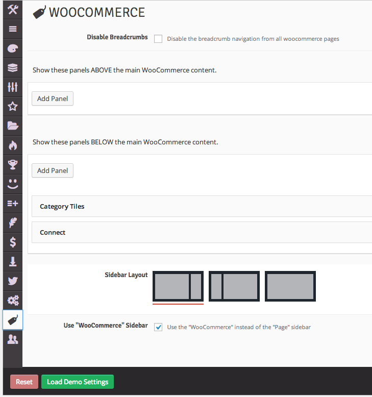
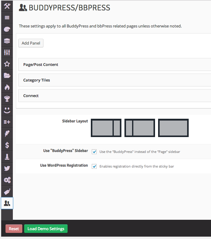
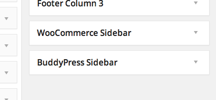
Because of the way BuddyPress is built versus how WooCommerce is built, you will need to edit your BuddyPress pages that were created when you installed BuddyPress and assign the BuddyPress Page template in order for the settings within the theme options to take effect. WooCommerce does not require you to do this.
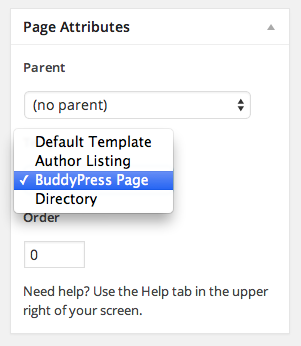
The BuddyPress and bbPress pages both use the BuddyPress theme options panel. You cannot separately adjust settings for only the bbPress pages at this time.
Troubleshooting & Tips
Using the theme is actually pretty self-evident, and whenever there is any information that needs to be conveyed you can find it by hovering over the help icon to the right of each setting in the theme options and also in the post and page meta box options. We have also created screecasts that detail step by step how to accomplish common theme tasks, such as setting up category colors/icons or using the shortcode generator. There are several additional helpful pieces of information that you may come across which are detailed below. Further questions that come up after the theme has been published will be added to the FAQs.
Theme Tips
- Names of rating criteria cannot match names of details or awards/badges (or “video” for featured video)
- You cannot use the word “content” for any of your rating criteria or details since that is a reserved WordPress word
- Number of user ratings displayed on single review articles doesn’t update live via AJAX (and shouldn’t since it’s an average)
- When a comment is deleted, the post custom meta fields are not deleted with it. This means if a user rates and/or submits pros/cons for an article via the comments and then their comment gets deleted, that user cannot post another comment with a rating and/or pros/cons again because that information still exists (but they can submit a standard comment)
- If an article has never been liked it will not show up when filtering for likes, but if an article has been liked once and then unliked back to 0 likes (this will probably rarely happen) it will show up when filtering for likes. However, it will show up correctly at the end of the list with 0 likes. The discrepancy is worth note because it can be confusing if some posts with 0 likes display and some with 0 likes don’t display.
- When adding carousel short codes to posts, do not use any left or right alignment on the main sliding image (you should only use block-level elements in carousels for them to function correctly). Image can be any size and will be responsively scaled down, it just can’t ahve alignright or alignleft classes.
- Longform posts are not able to display a sidebar even if you have chosen to show a sidebar for the post.
- To get images to expand beyond the left and right alignment of the main content on longform posts (like the demo) you need to set the alignment of the inserted image to “center”.
- Any page with the Directory template assigned will not be able to display a sidebar even if you set it to display in the page options.
“Theme Check” Explanation
If you run the Theme Check plugin, which is a requirement for submitting themes to ThemeForest and the WordPress plugin directory, you’ll notice some warnings/errors that warrant explanation. Here is a list of the warning messages that occur and the explanation as to why each of them exists:
No reference to add_theme_support( ‘custom-header’, $args )
Explanation: The theme does not support using a custom image for the header. You can use a custom logo and a custom background, but due to the nature of the theme layout there really isn’t a container for a header-specific image.
Found base64_encode
Explanation: This is needed for serializing the theme options in order for users to be able to export and import their theme options. There is no malicious code or file operations and it is purely for theme settings importing/exporting purposes and only available to the site admin.
file_get_contents was found, curl_init was found, curl_exec was found, and shell_exec was found
Explanation: Required by the functions in the widget that displays Twitter, Facebook, and Google+ social counts. This is the standard way of obtaining this information and interacting with the social media vendor APIs and there is no malicious code or file operations happening.
Possible hard-coded links were found
Explanation: Yes, there are a few places where hard-coded links are purposefully present, including the credits link in the footer to Google Fonts and the demo panel link to the theme features.
Performance & Optimization
We have optimized all of the images used in our live preview using the EWWW Image Optimizer plugin which greatly reduces filesizes of images without sacrificing quality. We also run W3 Total Cache on our demo (only page and browser caching, not database or object caching) to make it as fast as possible, but this is not a requirement as the theme is very fast even without it. For instance, icon fonts are used instead of icon images which provides two benefits: performance and HiDPI/retina capability.
We know it’s important that your site is as fast as possible, which is why we’ve designed the theme to be as fast as possible. However if you test the theme using page speed metric sites like Pingdom and GTMetrix you’ll always see room for improvement. It’s important to note that not all site performance measures can be accomplished purely in the code – a lot of it has to do with web server settings (i.e. “Next Level” adjustments), external assets like images, and third-party code. To further fine-tune the speed of your site we recommend following the techniques described in the page speed testers, and if you need professional expertise we recommend Elto or Envato Studio for great developers.
We have extensively tested the theme using various page speed metric sites and fine-tuned it as much as we possibly could before we released it. Here is an itemized list of common recommendations we came across during our testing, along with our explanation of precisely why the issue is either irrelevant to the actual theme code or why we chose not to implement it:
Combine external JavaScript & Make Fewer HTTP requests
Explanation: The theme only uses 4 javascript files, one for Bootstrap, one for the theme’s jQuery plugins, one for the theme’s custom javascript, and one for the theme’s AJAX requests. The rest of the files are enqueued correctly and via best practices from WordPress’s internal js library and thus cannot be combined. The reason the Bootstrap, plugins, scripts, and AJAX javascript files are not combined is to make it easier to update Bootstrap in the future, and serving 4 js files instead of 1 has such a negligible impact that we are not worried about it. Besides, they are all compressed and minified. If you’d like to reduce your HTTP requests, we recommend using W3 Total Cache to combine your javascript and css files.
Remove query strings from static resources
Explanation: This is again referring to the javascript imported directly from within WordPress’s internal libraries, and WordPress requires that querystrings be used in the enqueueing functions (in other words, this is not a theme issue but rather an inherent WordPress nuance).
Reduce the number of DOM elements
Explanation: Just add less page builder panels to the page to get less DOM elements. You have complete control over how simple or complex your site is because of how easy it is to use the theme’s page builders.
Reduce DNS Lookups
Explanation: This comes from the +AddThis sharing plugin. Even though is a low priority enhancement according to GTMetrix, if you do want to improve it you would need to get rid of +AddThis for sharing.
Combine images using CSS sprites
Explanation: This only applies to images that are available for users to upload one by one in the theme options, such as awards, badges, and category icons. We use them as background images for performance reasons, and that in turn trips the flags in some of the performance testing tools even though it’s irrelevant.
Serve resources from a consistent URL
Explanation: This is caused by Facebook integration within the social widgets and there is nothing to be done on the theme’s end (in other words, this is not a theme issue but rather an inherent third-party vendor-specific nuance).
Specify image dimensions
Explanation: The Pinterest widget displays images without image dimensions. Just don’t use it and you won’t have this issue. There’s nothing that can be done on the theme’s end (in other words, this is not a theme issue but rather an inherent third-party vendor-specific nuance). All image dimensions are specified correctly within the theme code.
Use a Content Delivery Network (CDN)
Explanation: This is a “next level” site enhancement and is irrelevent to the theme. It is completed up to you whether or not you choose to use a CDN, and doing so requires you to set it up on your web server, not within the theme files.
Migrating from previous IndustrialThemes minisite-enabled themes
Info This refers to the following themes: SwagMag, Made, Flavor, and Steam. Upgrading from our newer category-based minisites themes (Explicit, Implicit, and Engine) does not require you to follow these steps.
If you are running a previous IndustrialThemes theme that allows minisite creation and want to upgrade to this theme, the biggest thing you need to take into account is that you will need to convert your existing minisite articles back into standard WordPress posts. You will not lose your articles, but you will need to open each article and re-apply your editor ratings, and you will also lose your existing user ratings, so be very cautious before migrating themes. Details will be retained from the previous theme, as well as likes, views, and comments. If you were not using minisites you can disregard this.
- Before you activate this theme, install the Convert Post Types plugin
Tip if you forget this step before installing this theme, you can revert back to the previous theme and still access your minisites - Create categories to correspond with each of your minisites, for instance if you have a “Movies” minisite then create a “Movies” category. The names don’t have to match, it’s your own preference on how you organize your content, this is just a recommendation.
- Go to Tools >> Convert Post Types
- Select the minisite in the “Convert From…” drop down and select post in the “Convert To…” drop down
- Select the corresponding category that you created above in the Categories select list
- Click Convert >> which will convert the post types
- Rinse and repeat for each minisite
- Activate this theme
- Go to Settings >> Permalinks and set your permalink structure to
/%category%/%postname%/
Important make sure if you have a subcategory that you also assign the parent category to the post or else it will put both the parent category and the subcategory in the URL causing it not to match the previous URL for the article - Go to Theme Options and create all of your previous Details and Rating Criteria (make sure they are named the same as before)
- Open each post and re-apply the editor ratings
Credits
Every asset we’ve used in this theme is either bought and paid for or available for free commercial use. Use the tabs below to locate licensing/copyright info for all of the external assets that make up the theme.
- Fontelico license: SIL
- Entypo license: CC BY-SA
- Font Awesome license: CC BY 3.0
- Modern Pictograms license: SIL
- MFG Labs license: SIL
- Zocial license: MIT
- Elusive license: SIL
- Web Symbols license: SIL
Some icons are used in the demo but not embedded within the theme files. These icons require attribution and are from The Noun Project. Listed below are attribution links to each of these icons:
- Biohazard designed by iconsmind.com from the Noun Project
- Vulcan Salute designed by iconsmind.com from the Noun Project
- Eight Ball designed by Mike Rowe from the Noun Project
- Airplane designed by Simon Child from the Noun Project
- Gift Box designed by Norbert Kucsera from the Noun Project
- Usa designed by Matthieu Rodrigues from the Noun Project
- Jack O Lantern designed by Ryan Mochal from the Noun Project
- Crown designed by Juan Pablo Bravo from the Noun Project
- Coins - public domain
- Unicorn designed by Pieter J. Smits from the Noun Project
- Light Bulb designed by Rohith M S from the Noun Project
- Headphones designed by Kevin Wynn from the Noun Project
- Security Camera designed by Alexandr Cherkinsky from the Noun Project
- Smart Watch designed by Sherrinford from the Noun Project
- Tablet designed by Chris Kerr from the Noun Project
- Smartphone designed by Javier Calvo Patiño from the Noun Project
- Smartphone designed by Leonardo Guerra from the Noun Project
- Video Game Controller designed by James Fenton from the Noun Project
- Video Game Controller designed by Regan Warner from the Noun Project
- Video Game Controller designed by Hysen Drogu from the Noun Project
- Gear designed by P.J. Onori from the Noun Project
- Tap designed by Yaroslav Samoilov from the Noun Project
- Plug designed by Mister Pixel from the Noun Project
- Star designed by Mike O'Brien from the Noun Project
- Tetris designed by Emily L from the Noun Project
- Help designed by Luis Prado from the Noun Project
- Tablet regular license
- Mobile phone and hand in flat style regular license
- Device regular license
- App development concept in flat style regular license
- Technology icons regular license
- Mobile technology concept regular license
- Cellphone camera regular license
- Smart watch design flat illustration concept regular license
- Website and mobile analytics concept regular license
- Mobile app development concept regular license
- beautiful young hipster woman using smartphone regular license
- Mobile apps flat illustration regular license
- Mobile phone user interface development illustration regular license
- Modern digital tablet on office desk regular license
- Flat modern mobile user interface concept regular license
- Mobile UI. regular license
- Smart phone regular license
- Flat mobile user interface design regular license
- Businessman talking on phone in coffee shop regular license
- Boostrap license: Apache License v2.0
- Superfish license: MIT and GPL licenses
- SmoothDivScroll license: GPL license
- resize event license: MIT and GPL licenses
- Flickr license: MIT
- Colorbox license: MIT
- RateIt license: Ms-PL
- Master Slider license: Extended License


